- Introduction
- Logos Are Becoming Smaller, Not Larger
- Brand Systems Matter More Than Individual Logos
- Typography Is Taking A Larger Role
- Motion Is Becoming Part Of Logo Design
- AI Is Changing The Process, Not The Principles
- Recognition Is Replacing Decoration
- The Trend Businesses Should Ignore
- Adaptive Logo Systems Are Becoming Standard
- Expressive Typography Is Carrying More Identity
- Human Texture Is Countering Automated Sameness
- Motion Logos Need Behavior Rules
- Gradients, Soft Depth And Tactile Color
- Retro And Heritage References Need A Reason
- AI-Assisted Identity Needs Governance And Rights Checks
- Micro-First Recognition Changes What Survives
- Accessibility Is Becoming A Design Requirement
- Spatial And 3D Treatments Are Supporting Experiences
- Symbols Need Cultural And Competitive Testing
- A Trend-Safe Rollout Protects Recognition
- The 2026 Logo Trend Map
- Audit The Current Logo Before Following A Trend
- How To Decide Whether A Logo Trend Fits Your Brand
- Logo Trend Approval Checklist
- Frequently Asked Questions
- Final Thoughts
Introduction
Every year brings a new collection of articles predicting the future of logo design. Some focus on visual styles. Others highlight colors, shapes or typography trends that appear to be gaining momentum. While these lists can be interesting, they often miss a larger point.
The most important changes in logo design are rarely about aesthetics alone. What truly changes is the way brands use logos, the environments where logos appear and the expectations customers develop when interacting with brands online. As technology evolves and digital experiences become increasingly fragmented, logo design continues to adapt.
For businesses, the challenge is not deciding whether a particular trend looks attractive. The challenge is understanding which changes represent temporary fashion and which reflect deeper shifts in communication.
The trends shaping 2026 are less about decoration and more about flexibility, clarity and recognition across a growing number of digital touchpoints.
Logos Are Becoming Smaller, Not Larger
One of the most significant changes in branding is not immediately obvious. Logos now appear in more places than ever before, yet many of those spaces are extremely small. Mobile navigation bars, browser tabs, app icons, smart devices and social media profiles all require logos to remain recognizable at reduced sizes.
As a result, designers are increasingly prioritizing clarity over complexity. Details that once looked impressive on printed materials often disappear when scaled down. Brands are responding by simplifying structures, reducing unnecessary elements and focusing on recognizable forms that remain effective across multiple environments.
The trend is not minimalism for the sake of minimalism. It is adaptability. The enduring principles of scalable logo design still apply: modern marks must function everywhere, not just in carefully controlled marketing materials.
Brand Systems Matter More Than Individual Logos
For decades, many businesses treated the logo as the centerpiece of branding. Today, companies are placing greater emphasis on complete identity systems.
Customers rarely encounter a logo in isolation. They experience websites, social content, advertising campaigns, email marketing, packaging and mobile applications. The logo remains important, but it functions as part of a larger ecosystem.
This shift is influencing design decisions. Logos are increasingly created to work alongside typography systems, color frameworks, motion design and digital interfaces rather than standing alone as independent graphics.
In 2026, successful branding is becoming less about individual assets and more about how those assets work together. That makes building a complete visual identity more important than polishing an isolated mark.
Typography Is Taking A Larger Role
Typography continues to gain influence within modern brand identity systems. Many organizations are discovering that distinctive typography can create recognition more effectively than complex graphic symbols.
As a result, wordmarks and typography-focused identities continue to gain popularity. This does not mean symbols are disappearing. Instead, brands are becoming more selective about where visual complexity is introduced.
Typography often carries a larger share of the recognition burden because it scales effectively, adapts easily across platforms and integrates naturally into digital products.
The result is a growing preference for identity systems built around strong typographic foundations. Teams should still apply this brand typography guidance before treating expressive type as a trend solution.
Motion Is Becoming Part Of Logo Design
Static logos still matter. However, logos increasingly exist within environments where movement is possible. Websites, mobile applications, social media platforms and digital advertising all provide opportunities for animation.
As a result, designers are beginning to think about logos not only as static marks but also as dynamic elements capable of motion. In many cases, subtle movement is enough to enhance recognition and improve user experience.
The important change is conceptual. Logos are no longer designed exclusively for still environments. They are being designed with motion in mind from the beginning.
AI Is Changing The Process, Not The Principles
Artificial intelligence has become one of the most discussed topics in creative industries. In logo design, however, the most significant impact is occurring behind the scenes rather than in the final result.
AI tools can generate concepts quickly, assist with ideation and accelerate portions of the design process. What they cannot replace is strategic thinking. Businesses still need to define positioning, audience expectations and brand personality before any design work begins.
Designers still need to evaluate ideas based on communication goals rather than visual novelty. A logo that looks impressive but fails to communicate effectively remains a weak solution regardless of how quickly it was produced.
The tools may change, but the principles remain remarkably consistent. This is why AI is influencing workflows more than outcomes. It changes how ideas are explored, not why those ideas succeed.
Recognition Is Replacing Decoration
Perhaps the most important trend of all is a renewed focus on recognition. For several years, many businesses pursued visual novelty in an effort to appear different. Some succeeded. Others created identities that were memorable for the wrong reasons.
Today, more organizations are prioritizing recognition over decoration. The question is no longer whether a logo looks interesting in a presentation. The question is whether customers can identify it quickly across dozens of digital environments.
Recognition requires clarity. It requires consistency. And it requires restraint. These priorities are shaping many of the branding decisions appearing throughout 2026.
The strongest logos are increasingly designed to be remembered rather than merely admired.
A logo that customers remember is often more valuable than a logo that designers admire.
The Trend Businesses Should Ignore
Every year also produces trends that receive more attention than they deserve. Businesses often feel pressure to redesign identities simply because a new visual style becomes popular. In many cases, this creates more problems than it solves.
Customers value familiarity. Recognition develops over time. Changing a logo purely to follow a trend can interrupt that process without providing meaningful benefits.
The strongest brands evolve carefully. They respond to genuine communication needs rather than temporary fashion cycles. A trend should support strategy. It should never replace it.
Businesses that understand this distinction are more likely to build long-term recognition while competitors continue chasing short-term attention.
Adaptive Logo Systems Are Becoming Standard
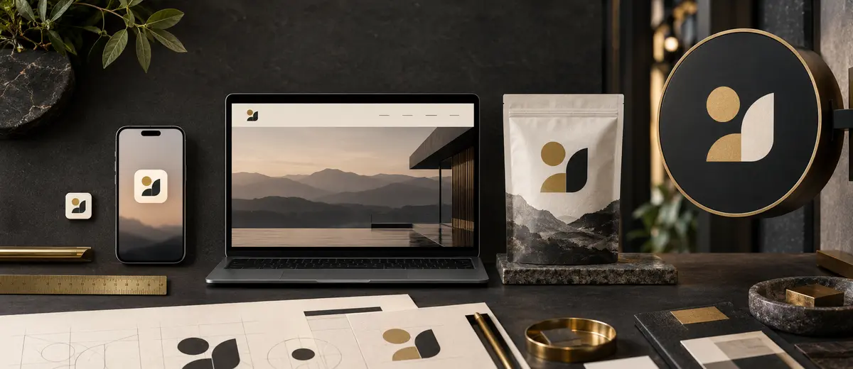
A responsive logo is not a collection of unrelated alternatives. It is a controlled family of signatures designed for different constraints. A full wordmark may lead a desktop page, a compact lockup may fit packaging, and a simplified symbol may serve an app icon. The relationship between those forms must be obvious enough that each exposure reinforces the same memory.
This is one of the most durable 2026 shifts because the underlying problem is not seasonal. Brands now appear in square avatars, narrow navigation bars, tiny favicons, wearable interfaces, video end cards and physical environments. One fixed composition cannot perform equally well in every space. The system therefore needs minimum sizes, clear-space rules, approved reductions and a defined fallback when detail becomes unreadable.
More Versions Require Better Governance
An adaptive system creates value only when teams know which version belongs where. Name the files clearly, remove obsolete exports and document selection rules. Flexibility without governance becomes inconsistency.
Expressive Typography Is Carrying More Identity
Many 2026 trend reports point toward exaggerated, custom or character-rich lettering. The useful interpretation is not that every brand needs a distorted wordmark. It is that typography is increasingly expected to do more than label a company. Letter shape, spacing, rhythm and movement can carry a distinctive voice across the entire identity, from a logo to interface headings and campaigns.
Variable fonts make this system more adaptable because width, weight or optical size can change within a controlled family. But flexibility does not excuse poor reading. A display treatment that works in a launch film may fail in a navigation bar, legal notice or translated interface. Before approving an expressive wordmark, test narrow widths, small sizes, common misreadings, required scripts and fallback behavior.
Fashionable Treatment Versus Durable System
| Decision | Trend-Led Version | System-Led Version |
|---|---|---|
| Typography | Distinctive in one mockup | Recognizable across logo, headings and product UI |
| Motion | Long reveal animation | Short behavior with a useful static endpoint |
| Color | One dramatic gradient | Accessible palette with flat-color fallbacks |
| Logo variants | Many creative alternatives | Limited approved forms with selection rules |
Human Texture Is Countering Automated Sameness
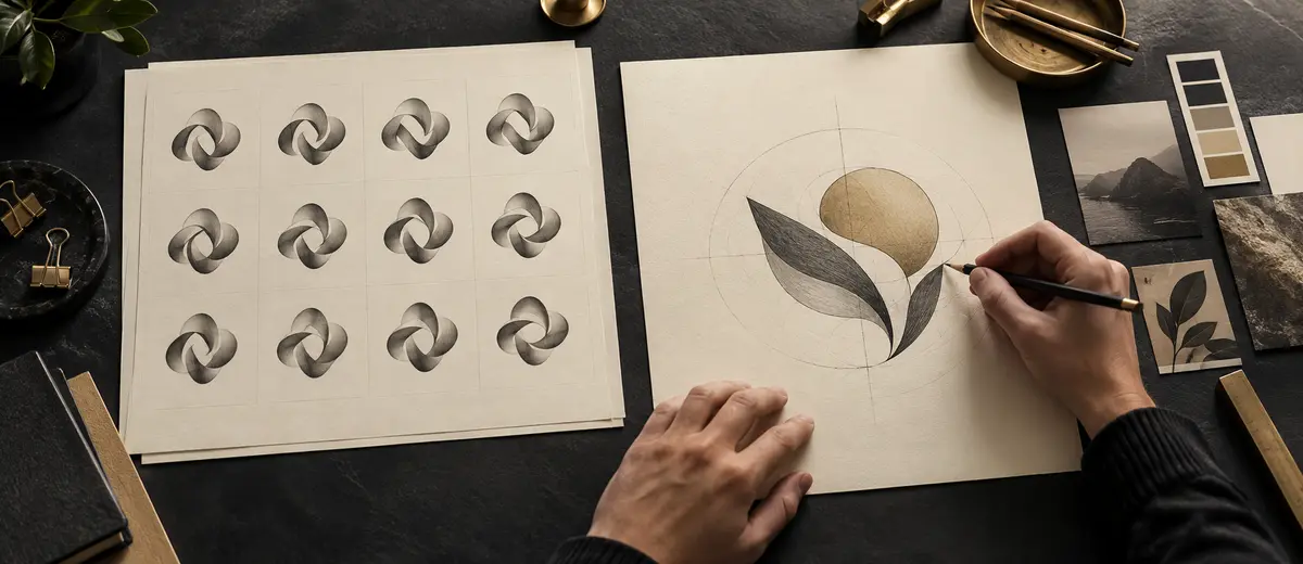
As polished generation tools become widely available, perfectly smooth output is no longer automatically distinctive. This helps explain the renewed interest in hand-drawn edges, tactile surfaces, irregular lettering, archival references and small signs of authorship. These qualities can make an identity feel specific rather than assembled from the same visual defaults as everyone else.
The strongest use of imperfection is intentional. A handmade mark still needs reproducible proportions, reliable files and a clean small-size version. Texture may belong in campaigns while the core mark remains simple. Brands should also avoid treating “human” as a visual costume. Genuine character comes from a relevant story, original decisions and consistent execution—not from adding random wobble to otherwise generic work.
Motion Logos Need Behavior Rules
A kinetic logo can introduce a product, acknowledge an interaction or connect scenes in video. In 2026, the important shift is that motion is being considered during identity design instead of being added after static files are approved. Designers are defining how elements enter, transform, respond and settle, creating recognizable behavior as well as recognizable shape.
Motion must remain optional rather than essential to identification. Reduced-motion preferences, slow devices, print, screenshots and accessibility contexts all require a strong static endpoint. Keep routine animations brief, avoid flashing or disorienting movement, and document timing, easing, sound and fallback rules. A logo animation is successful when it reinforces meaning without delaying the user.
Design The Resting Frame First
If the final static frame is weak, motion is hiding a design problem. Approve the resting mark at favicon, mobile-header and monochrome sizes before developing animation.
Gradients, Soft Depth And Tactile Color
Gradients, glows and dimensional treatments remain visible in technology and entertainment identities because they can suggest energy, atmosphere and movement. At the same time, warmer earth tones and softer organic palettes are being used to reduce the coldness associated with automated digital products. These directions appear contradictory, but both are attempts to create emotional distinction in crowded interfaces.
A color effect should never be the only carrier of recognition. Test the mark in one color, against light and dark backgrounds, in print and under reduced contrast. Define accessible supporting colors for text and interface controls rather than sampling every shade from the logo. For production, provide flat-color and embroidery-safe alternatives so the identity does not collapse when a gradient cannot be reproduced.

Retro And Heritage References Need A Reason
Gothic lettering, seals, pixel forms, neo-deco geometry and retro-futurist references are all appearing in 2026 coverage. Nostalgia can create familiarity and cultural texture, especially when a business has a real connection to a place, craft, archive or community. It can also become costume when the borrowed era has nothing to do with the brand.
Before adopting a heritage style, identify the specific association it should trigger and verify that the audience shares that association. Research symbols and letterforms across markets; historical imagery can carry political, religious or exclusionary meanings that a mood board misses. Build a contemporary operating system around the reference so accessibility and digital use do not become afterthoughts.
Using Nostalgia As A Substitute For Positioning
A vintage badge cannot manufacture heritage, and a futuristic gradient cannot prove innovation. Choose a reference only when it supports a credible brand story and remains understandable to the intended audience.
AI-Assisted Identity Needs Governance And Rights Checks
AI is accelerating exploration, variation and production, but speed increases the need for judgment. Teams can generate hundreds of directions before they have defined the problem, creating more noise rather than better options. Begin with a clear logo brief, audience, competitive context and evaluation criteria. Use generation to explore possibilities, then apply human selection, drawing, testing and documentation.
Provenance and rights deserve explicit review. Record the tools and source materials used, check vendor terms for commercial use, avoid prompting with a living designer’s signature style, and conduct trademark searches before investment. Generated output can resemble existing marks even without deliberate copying. A visually pleasing concept is not automatically ownable, registrable or defensible.
Micro-First Recognition Changes What Survives
Many customers first meet a brand through a search result, app icon, social avatar or payment screen. This makes the smallest useful version a strategic asset. Distinctive silhouettes, controlled negative space and one memorable interruption—a notch, cut, dot or unusual proportion—often survive reduction better than complex illustrations.
Micro-first does not mean designing only an icon. The complete name still matters for new audiences, search visibility and legal clarity. A robust system pairs a compact mark with legible wordmarks and defines when each appears. Test recognition without color, next to competitors and at actual device sizes rather than judging enlarged vectors on an artboard.
Accessibility Is Becoming A Design Requirement
Accessibility is not a visual fashion, yet it increasingly determines which logo systems are practical. Thin strokes can disappear under low contrast, rapid motion can create discomfort, color-only distinctions can fail, and highly stylized lettering can make a company name difficult to decode. A contemporary identity should work for more people without requiring a separate, lesser version of the brand.
Test the mark in the contexts where identification matters. Provide a reduced-motion outcome, meaningful alt text when an image conveys information, and readable wordmarks at actual sizes. Accessibility review belongs during concept selection; retrofitting it after approval usually produces awkward compromises.
Recognition Uses More Than One Cue
Customers identify a brand through combinations of name, shape, color, type, motion, sound and experience. A resilient system never makes one fragile cue carry the entire identity.
Spatial And 3D Treatments Are Supporting Experiences
Dimensional marks, material simulations and spatial animation remain attractive for gaming, entertainment, events and immersive products. Modern rendering tools make these treatments easier to produce, but that accessibility can create sameness. Chrome, glass and inflated forms are effects, not strategies. They should extend a recognizable core mark rather than replace it.
Begin with clean vector geometry and define how depth, camera movement, light and material may be applied. Preserve a flat master for print, engraving, embroidery, accessibility and fast-loading interfaces. A 3D expression is valuable when it helps the brand behave in space or tells a relevant story; a metallic mockup alone does not make an identity future-ready.
Symbols Need Cultural And Competitive Testing
Organic shapes, spirals, arrows, sparkles, chat bubbles and abstract portals recur throughout contemporary identity design. Familiar forms can communicate quickly, but popularity increases collision risk. A symbol may carry an unintended meaning in another market or look almost identical to a competitor when reduced to an app icon.
Test the idea in the countries, languages and categories where it will appear. Search visually similar marks, review trademark classes with qualified counsel and ask audience members what they see before explaining the concept. The psychology behind logo interpretation matters because meaning is created by audience experience, not by the designer’s intention alone.
A Trend-Safe Rollout Protects Recognition
Even a strategically sound update can damage recognition when implementation is fragmented. Inventory every customer-facing touchpoint, prioritize high-visibility and high-risk assets, prepare correct files, brief internal teams and vendors, and define when the old identity must stop appearing. During transition, customers may need continuity cues such as the existing name, familiar color or a short explanation.
Measure whether people still recognize and correctly attribute the brand. Track recurring implementation errors, support confusion and production delays as well as subjective reactions. If the change is only a campaign expression, keep it inside a defined time and channel boundary. Thoughtful rollout preserves the recognizable color system and other equity already built.
The 2026 Logo Trend Map
Trend lists become more useful when similar observations are grouped by the need beneath them. Adaptive marks, morphing forms and responsive lockups answer the need for flexibility. Pixel-sharp symbols, micro details and refined minimalism answer the need for small-screen recognition. Expressive type, freehand drawing and tactile texture answer the need for human character. Gradients, spatial forms and motion answer the need for richer digital behavior.
These families can overlap, but they should not be stacked automatically. A logo does not become stronger because it is simultaneously animated, organic, three-dimensional, variable and nostalgic. Choose the smallest combination that expresses the strategy and works in production. Restraint makes the distinctive decision easier to notice.
Trend Family And The Problem It Can Solve
| Trend Family | Useful When | Primary Risk |
|---|---|---|
| Adaptive systems | One signature fails across many formats | Uncontrolled variants dilute recognition |
| Expressive typography | The name can become a strong memory cue | Legibility or language coverage suffers |
| Human texture | The category looks automated and uniform | Artificial imperfection becomes another cliché |
| Motion identity | Digital interactions can reinforce behavior | Animation delays or distracts users |
| Gradient and depth | Atmosphere supports a digital-first position | The mark fails without effects |
| Heritage references | A real story connects past and present | Borrowed nostalgia misrepresents the brand |
Audit The Current Logo Before Following A Trend
A trend discussion should begin with evidence about the identity already in use. Collect the official logo files and examples from the website, product, social channels, sales materials, packaging, signage and partner use. Note where teams improvise alternatives, where the mark becomes unreadable, and which assets customers recognize most reliably.
Separate execution problems from design problems. An incorrect file, weak contrast or inconsistent placement may be solved through better guidelines and asset management rather than a redesign. Conversely, a detailed mark that cannot reduce, a confusing name lockup or missing digital variant may require structural work. This distinction prevents a costly rebrand from being used to solve an operational issue.
Review competitors at the same real sizes and channels. Look for category conventions that help comprehension, then identify where they create sameness. The objective is not maximum difference; it is ownable recognition without losing relevance. Document what must remain, what may evolve and what evidence will determine success before creative exploration begins.
Preserve Equity Before Adding Novelty
List the colors, shapes, name treatments and behaviors customers already associate with the business. A successful update strengthens useful equity instead of resetting recognition simply to look current.
How To Decide Whether A Logo Trend Fits Your Brand
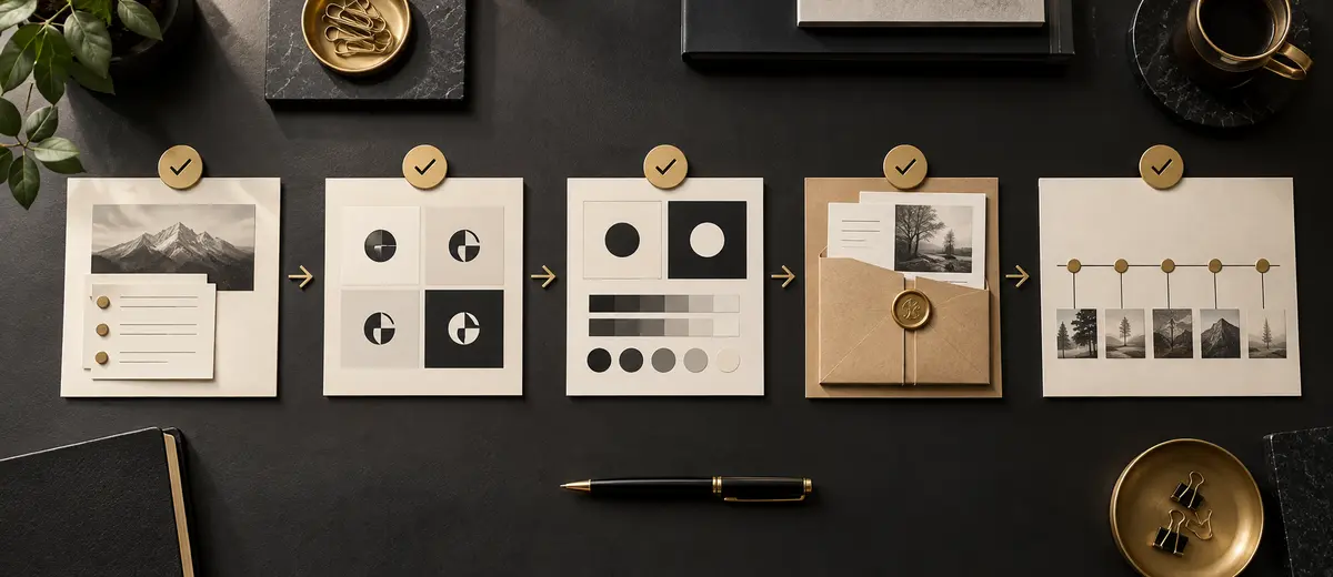
Start with the communication problem, not the trend name. Is the current identity unreadable at small sizes? Does it lack a usable motion behavior? Are teams improvising inconsistent variants? Is the typography generic within the category? A trend is relevant only when it offers a credible response to a diagnosed weakness.
Diagnose
Identify a real recognition, usability or system problem.
Prototype
Apply the direction to one controlled concept, not the entire brand.
Stress-Test
Check audiences, sizes, channels, accessibility, rights and production.
Decide
Adopt, adapt or reject it using documented evidence.
Logo Trend Approval Checklist
- The direction solves a documented business or communication problem.
- The core mark remains recognizable without animation, texture or gradient.
- Full, compact and micro versions share obvious visual DNA.
- Typography is readable across required sizes, scripts and languages.
- Color combinations have accessible and production-safe alternatives.
- Motion includes a useful static endpoint and reduced-motion behavior.
- The concept is distinguishable from competitors and common templates.
- Source, licensing and trademark risks have been reviewed.
- Teams can reproduce the system using clear files and rules.
- The identity can evolve after the trend fades.
Frequently Asked Questions
The most durable shifts are adaptive logo systems, micro-first recognition, expressive typography, motion behavior and AI-assisted workflows with stronger governance. Tactile, organic, gradient, heritage and retro styles are visible aesthetic directions, but they should be adopted only when they fit the brand.
Yes, particularly where small-screen clarity matters. The stronger direction is minimalism with a distinctive memory cue rather than generic simplification. A simple mark still needs recognizable proportions, typography or behavior.
Not without a diagnosed problem. Redesign when the identity no longer supports strategy, recognition, accessibility or required channels. Fashion alone rarely justifies discarding recognition that customers have already learned.
It is a controlled family of related logo configurations for different spaces and contexts, such as a full signature, compact lockup and micro symbol. Clear rules determine which version is used.
Always. Print, reduced-motion settings, screenshots, slow devices and many interfaces require a strong static endpoint that remains recognizable without animation.
AI can accelerate exploration, but professional identity work still needs strategy, human selection, original refinement, accessibility testing, production files, licensing review and trademark clearance.
They can be effective in digital contexts when the brand also has accessible flat-color, monochrome and production-safe versions. Recognition should not depend on one effect.
Distinctive typography can identify the company while supporting a wider interface and communication system. It is valuable when the lettering remains legible and usable across languages and sizes.
It means testing recognition in the smallest important environments early, including favicons, app icons and avatars, instead of shrinking a detailed presentation logo at the end.
Heritage, gothic, seal, pixel and retro-futurist references are visible in 2026. They work best when connected to a credible story and tested for cultural meaning and modern usability.
A useful structural shift can support a brand for years, while a surface treatment may date quickly. Approve a direction only if the identity remains coherent after the fashionable effect is removed.
Protect stable recognition cues, define where experimentation is allowed, test new expressions in controlled applications and document approved variants before distributing them.
Key Takeaways
Use these four principles when evaluating any 2026 logo direction.
Follow Problems, Not Fashion
Adopt a trend only when it solves a real communication or system need.
Design A Recognizable Family
Make full, compact, micro, static and motion forms reinforce one memory.
Test The Real Conditions
Check sizes, channels, accessibility, production, rights and competitors.
Protect Long-Term Equity
Keep the identity useful after the fashionable surface treatment fades.
Final Thoughts
The future of logo design is not being defined by a single visual style. Instead, it is being shaped by changing customer behavior, evolving technology and new communication environments. Logos are becoming more adaptable, typography is gaining influence, motion is becoming more common and brand systems are growing more important than individual design elements.
Yet despite these changes, the core objective remains the same. A logo exists to help customers recognize and remember a brand. The tools, platforms and design approaches may evolve, but that goal remains remarkably consistent.
For businesses planning branding projects in 2026, the most valuable trend may not be a visual trend at all. It may simply be the growing realization that clarity, recognition and adaptability matter more than novelty.
The brands that thrive in the coming years will not necessarily be the most fashionable. They will be the easiest to recognize, the easiest to remember and the easiest to trust.