- What Is Visual Identity?
- Brand Identity vs Visual Identity
- Why Recognition Comes From Systems
- Core Elements Of A Visual Identity
- Building A Visual Language
- Consistency Across Touchpoints
- Visual Hierarchy
- Photography & Illustration Style
- Iconography System
- Brand Guidelines
- Design Systems
- Visual Identity Audit
- Common Mistakes
- FAQ
- Final Thoughts
What Is A Visual Identity?
Ask ten business owners what creates a recognizable brand and most of them immediately answer with one word — logo. While a logo is undoubtedly important, it represents only one small part of the complete visual experience customers remember.
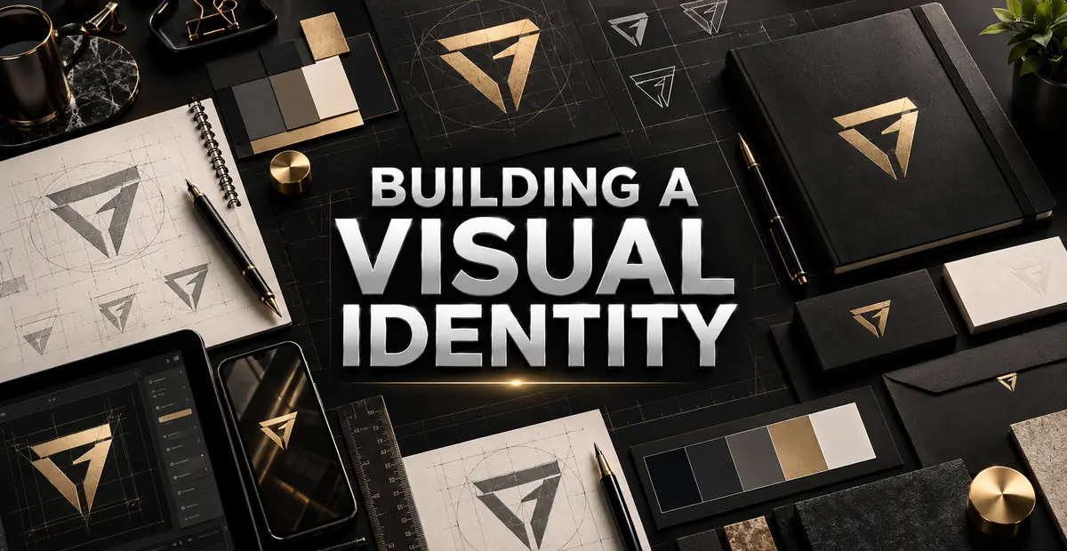
Visual identity is the collection of every visual element a company uses to communicate with its audience. It includes the logo, colors, typography, imagery, icons, layouts, illustrations, spacing, motion and every other design decision that customers repeatedly encounter.
Think about the last time you instantly recognized a company while scrolling through social media. In many situations you probably identified the brand before reading its name. That recognition happened because your brain processed familiar visual patterns accumulated through repeated exposure rather than a single logo.
A professional visual identity transforms isolated marketing materials into one connected experience. Every website page, advertisement, presentation, product package and social media post should feel as though it belongs to the same organization regardless of where customers encounter it.
Recognition Begins Before Reading
Customers often recognize visual patterns long before they consciously process company names. Strong visual identities shorten this recognition process, helping businesses become familiar faster while strengthening trust over time.
Brand Identity vs Visual Identity
These two terms are frequently used interchangeably, but they describe different concepts.
Brand identity defines who a business is, what it believes, how it communicates and what customers should experience. Visual identity represents the visible expression of those ideas through design.
A company may have a clearly defined mission and excellent customer service, but if every visual asset looks inconsistent, customers struggle to recognize it. Likewise, an attractive visual identity without meaningful business values eventually loses credibility because appearance cannot replace experience.
Brand Identity vs Visual Identity
| Brand Identity | Visual Identity |
|---|---|
| Purpose, mission and values | Logo, typography, colors and imagery |
| Personality and voice | Visual communication |
| Customer experience | Customer recognition |
| Internal strategy | External presentation |
Customers experience a brand through many interactions, but visual identity is often the first conversation they have with your business.
Recognition Comes From Systems — Not Individual Designs
One beautifully designed advertisement cannot create meaningful brand recognition. Recognition develops only after customers repeatedly encounter familiar visual patterns across multiple environments.
Successful companies rarely rely on individual design pieces. Instead, they build systems capable of producing thousands of consistent marketing assets while maintaining the same personality.
Imagine replacing every page of a website with a different typography style, introducing random colors across advertisements and using unrelated photography on social media. Each individual design might still look attractive, yet customers would struggle to recognize the organization behind them.
Professional visual identity solves this problem by establishing repeatable design principles instead of isolated creative decisions.
Core Elements Of A Visual Identity
Visual identity is never built from one component. It is the combination of multiple design elements working together to communicate one consistent personality. Each element performs a different role, but all of them should reinforce the same message.
Logo
The logo acts as the signature of the brand. It provides a recognizable symbol that appears across every customer touchpoint. However, it should never carry the entire responsibility of recognition on its own.
Color Palette
Colors establish emotional direction and improve recognition through repetition. They also create hierarchy, guide attention and support usability throughout digital and printed materials.
Typography
Fonts influence personality while improving readability. A consistent typography system allows websites, presentations, advertisements and printed materials to communicate with one recognizable voice.
Photography
Photography should follow consistent composition, lighting, editing style and subject matter. Random stock images weaken identity because customers stop recognizing visual patterns.
Illustrations
Illustration styles should maintain similar stroke widths, colors, proportions and complexity. Consistency helps illustrations become part of the identity rather than isolated decorative graphics.
Icons
Icons communicate information quickly. A unified icon style improves navigation while reinforcing the overall design language.
Layouts
Spacing, alignment, grids and composition influence how customers perceive quality. Well-structured layouts quietly improve professionalism without attracting unnecessary attention.
Every Element Should Speak The Same Language
Customers should never feel as though different departments created different parts of the brand. Visual identity succeeds when every asset appears to belong to the same organization.
Building A Visual Language
Visual language refers to the collection of design decisions customers repeatedly associate with one organization. Unlike a single campaign, a visual language evolves over years while remaining recognizable.
Professional brands define consistent spacing, corner radius, shadows, button styles, illustration techniques, photography treatments and graphic elements long before individual marketing campaigns begin.
When these visual rules remain consistent, customers require less effort to recognize the brand because every design follows familiar patterns.
Instead of asking whether each design looks attractive, experienced designers ask a different question: Does this look like our brand?

Consistency Reduces Cognitive Load
Customers spend less effort understanding familiar visual systems. Instead of learning a new interface or design style each time, they immediately recognize how information is organized.
Consistency Across Every Customer Touchpoint
Customers rarely experience brands through only one channel. They may first discover a company on social media, later visit its website, receive an email, see product packaging and finally enter a physical location.
Every interaction should reinforce the same identity. Differences in typography, colors, photography or layout create unnecessary friction that weakens recognition.
- Website and landing pages
- Mobile applications
- Social media graphics
- Packaging and labels
- Business cards
- Sales presentations
- Advertising campaigns
- Email newsletters
- Invoices and documentation
- Office signage
- Uniforms
- Trade show displays
Every Customer Touchpoint Shapes Perception
Customers judge professionalism by consistency. Even small inconsistencies repeated across multiple interactions gradually reduce confidence in the business.
Creating Visual Hierarchy Across The Entire Brand
Visual hierarchy extends beyond typography. It determines how customers discover information throughout websites, presentations, advertisements and printed materials.
Hierarchy guides attention toward the most important information first before leading customers naturally through supporting content.
Professional brands establish consistent hierarchy using spacing, scale, color emphasis, imagery placement, button styles and alignment rather than relying on decorative effects.
Notice
Capture attention using strong visual structure.
Understand
Present the most important message clearly.
Explore
Guide customers through supporting information.
Act
Encourage confident decision making.
Photography And Illustration Style
Photography is often one of the most overlooked components of a visual identity. Many businesses invest considerable time selecting logos, typography and colors, yet use completely unrelated stock photographs across different marketing channels. The result is a fragmented identity where every campaign appears to belong to a different company.
Professional brands define photography before producing campaigns. They establish consistent lighting, camera angles, composition, editing style, subject matter and emotional tone. Whether customers visit the website, view social media or receive a printed brochure, the photography should immediately feel familiar.
Illustrations deserve the same level of consistency. Stroke width, corner radius, perspective, color usage and overall complexity should follow one recognizable visual system. Mixing flat illustrations with highly realistic artwork or randomly switching between styles weakens recognition and reduces professionalism.
When photography and illustration work together, they become recognizable assets instead of decorative additions.
Photography Builds Recognition Too
Many global brands can be recognized through photography style alone, even before their logo appears. Consistent visual treatment becomes part of the brand's identity.
Building A Consistent Iconography System
Icons appear throughout modern branding. They guide navigation, simplify complex information and improve user experience. Unfortunately, many organizations collect icons from different sources, producing inconsistent stroke widths, corner shapes and visual proportions.
A professional icon system establishes one design language that every icon follows. Whether an icon represents security, customer support, products or settings, it should appear as though it belongs to the same family.
Consistency should include outline thickness, fill style, corner radius, proportions and spacing. These details may seem insignificant individually, but together they contribute significantly to perceived quality.
Consistent Icons vs Random Icons
| Consistent System | Random Collection |
|---|---|
| Same stroke width | Mixed outline thickness |
| Unified proportions | Different visual weights |
| Consistent spacing | Irregular alignment |
| Recognizable identity | Disconnected appearance |
Why Every Brand Needs Visual Guidelines
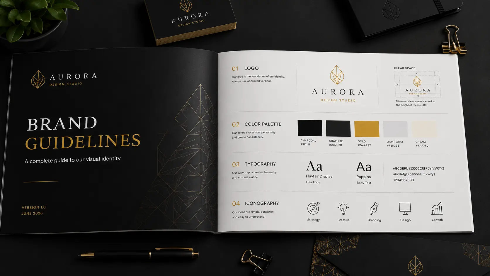
A visual identity only becomes valuable when other people can reproduce it consistently. Brand guidelines transform creative decisions into repeatable standards that designers, developers, printers and marketing teams can follow regardless of who creates future assets.
Without documented guidelines, every new campaign introduces personal interpretation. Colors gradually change, typography becomes inconsistent and layouts begin drifting away from the original identity.
Professional guidelines explain not only what to use but also what should never be used. Examples of incorrect logo placement, poor color combinations, inconsistent spacing and typography misuse prevent quality from declining over time.
- Logo usage rules
- Clear space requirements
- Minimum size specifications
- Color palette values
- Typography hierarchy
- Photography direction
- Illustration style
- Icon system
- Spacing system
- Layout grids
- Social media templates
- Website UI standards
Guidelines Protect Future Consistency
Brand guidelines are not creative restrictions. They allow creativity to grow while ensuring customers continue recognizing the business over time.
Visual Identity And Design Systems
As organizations grow, maintaining consistency becomes increasingly difficult. Modern companies therefore expand brand guidelines into complete design systems that include reusable interface components, spacing tokens, buttons, cards, forms, navigation patterns and accessibility standards.
Instead of redesigning every screen independently, teams reuse approved components that already follow the established visual identity. This dramatically improves consistency while reducing development time.
Design systems are especially valuable for businesses managing websites, mobile applications, internal software and multiple digital products because every interface continues speaking the same visual language.
Consistency Scales Better Than Creativity Alone
Great brands are rarely built through constant redesign. They grow by repeating recognizable design patterns while introducing new ideas within an established system.
Performing A Visual Identity Audit
Even established organizations gradually lose consistency as new campaigns, departments and external agencies contribute fresh marketing materials. A visual identity audit helps identify these inconsistencies before they weaken customer recognition.
- Logo usage remains consistent.
- Typography follows approved hierarchy.
- Colors match official palette.
- Photography follows one editing style.
- Icons belong to one visual family.
- Layouts maintain consistent spacing.
- Social media templates match website.
- Marketing materials feel connected.
- Printed assets match digital assets.
- Brand guidelines remain updated.
Inconsistency Happens Gradually
Most brands do not become inconsistent overnight. Small design changes accumulate over months until customers begin noticing that different materials no longer feel connected.
Common Visual Identity Mistakes
Creating a visual identity is only the beginning. Maintaining it consistently over months and years is what separates memorable brands from forgettable ones. Many businesses unknowingly weaken their identity through small decisions that slowly accumulate until recognition begins to disappear.
Strong Brands vs Weak Brands
| Strong Visual Identity | Weak Visual Identity |
|---|---|
| Consistent design language | Different styles everywhere |
| Documented guidelines | No standards |
| Limited color palette | Random colors |
| Consistent photography | Mixed stock photos |
| Unified icon system | Icons from multiple libraries |
| Repeatable layouts | Every page looks different |
Changing The Brand Too Frequently
Many businesses redesign their visual identity simply because they become bored with it. Customers, however, have only begun recognizing it. Constant redesign interrupts recognition before it has time to develop.
Following Every Design Trend
Modern trends can inspire new ideas, but building an identity entirely around temporary styles often makes a brand look outdated within a few years. Strong identities evolve gradually instead of chasing every trend.
Ignoring Documentation
When visual decisions exist only in a designer's memory, consistency becomes impossible as businesses grow. Clear documentation allows teams, agencies and developers to create work that feels connected.
Trying To Look Like Competitors
Copying successful competitors rarely creates memorable brands. Recognition comes from distinctiveness rather than similarity.
Consistency Always Wins
Customers rarely compare your latest advertisement with your previous campaign. Instead, they unconsciously compare every interaction they've ever had with your brand. Consistency is what makes those experiences feel connected.
Frequently Asked Questions
A visual identity is the complete collection of visual elements a business uses to communicate with customers. It includes logos, typography, colors, imagery, layouts, icons, illustrations and other design assets that create consistent recognition.
No. Branding includes strategy, values, positioning, customer experience and communication. Visual identity is the visible expression of that strategy through design.
Consistency helps customers recognize your business more quickly, builds familiarity and strengthens long-term trust across every marketing channel.
Professional brand guidelines typically include logo rules, typography, color palettes, photography direction, iconography, layouts, spacing, accessibility recommendations and examples of correct and incorrect usage.
Absolutely. Even a simple, well-documented visual identity helps small businesses appear more professional while improving customer recognition as they grow.
The timeline depends on the size and complexity of the business. A focused identity for a small company may take several weeks, while a larger system involving research, multiple applications, testing and documentation can take several months.
A visual identity should evolve only when business strategy, audience expectations or technology genuinely require change. Thoughtful refinements usually protect recognition better than frequent redesigns.
Key Takeaways
A recognizable visual identity is built through a connected system of repeatable decisions. Review the most important lessons before continuing your branding journey.
Build A Complete System
A logo is only the beginning. Typography, colors, imagery, icons and layouts must work together as one visual language.
Design For Recognition
Consistent systems create stronger recognition than isolated designs, even when individual pieces look impressive.
Document The Rules
Clear brand guidelines and reusable design systems allow teams to maintain quality as the business grows.
Evolve With Discipline
Strong identities improve carefully over time instead of changing whenever a new design trend appears.
Final Thoughts
A memorable visual identity is not built through one impressive logo or one successful marketing campaign. It is created through hundreds of consistent decisions repeated across every customer interaction.
When logos, typography, colors, photography, layouts and graphic elements all work together, recognition becomes almost effortless. Customers stop evaluating individual designs and begin recognizing the business behind them.
Whether you are launching a startup, refreshing an existing brand or expanding into new markets, your visual identity should function as a complete system rather than a collection of disconnected assets.
The goal is not simply to make your business look attractive. The goal is to build something customers instantly recognize, remember and trust wherever they encounter it.