
- Why Brand Colors Matter
- Understanding Color Psychology
- Why Context Changes Color Meaning
- Audience And Market Research
- Major Brand Color Families
- Warm, Cool And Neutral Palettes
- Color Harmony Systems
- Choosing A Primary Brand Color
- Building A Complete Palette
- Color Hierarchy And The 60-30-10 Rule
- Contrast And Accessibility
- Light And Dark Backgrounds
- Digital, Print And Packaging Color
- Cultural And Global Considerations
- Competitor Research And Distinctiveness
- Professional Color Testing
- Documenting Brand Color Guidelines
- Brand Color Approval Checklist
- Common Brand Color Mistakes
- Building Long-Term Recognition
- Frequently Asked Questions
- Final Thoughts
Why Brand Colors Matter
Color is often processed before a customer reads a brand name, studies a logo or understands a marketing message. A palette therefore influences the earliest stage of brand perception. It can make a business feel calm, energetic, premium, practical, playful or authoritative within seconds.
Color also supports recognition. When the same palette appears across a website, product, advertisement, social profile, presentation and physical environment, customers begin connecting those colors with the organisation. Repetition turns a visual choice into a memory cue.
The strongest palettes do more than look attractive. They help organise information, guide attention, support accessibility and make important actions easier to find. A useful brand color system must therefore balance emotion, identity and practical performance.
Poorly selected colors create the opposite effect. They can reduce contrast, make interfaces confusing, imitate competitors or communicate a personality that conflicts with the actual business. Strategic color selection begins with purpose rather than personal preference.
Brand colors are not decoration added after strategy. They are part of the strategy because they influence recognition, communication and usability at every customer touchpoint.
Color Creates Expectations Before Experience
Customers often use visual signals to estimate whether a business feels reliable, affordable, innovative or premium. A palette cannot replace product quality, but it can shape the expectations customers bring into the first interaction.
Understanding Color Psychology
Color psychology examines how colors influence emotion, attention and behaviour. It is useful for branding, but it should not be treated as a rigid formula. The same color can communicate different ideas depending on shade, saturation, contrast, category and cultural context.
A dark navy may feel conservative and dependable, while a bright electric blue may feel energetic and technological. Soft green can suggest wellbeing, while deep forest green may communicate heritage or premium natural materials. The color name alone does not determine the final meaning.
Brand strategy should therefore use color psychology as evidence, not as a shortcut. Designers should combine general associations with audience research, competitor analysis and testing in realistic applications.
Meaning Comes From The Whole System
A color is interpreted together with typography, imagery, wording, layout and customer experience. Blue does not automatically create trust, and black does not automatically create luxury. The complete identity determines the message.
Why Context Changes Color Meaning
Color associations are shaped by experience. Red may signal urgency in a warning, appetite in food packaging, celebration in a cultural event or passion in entertainment. Context changes the interpretation.
Industry expectations matter as well. Green may feel natural in wellness or agriculture, but the same green can communicate growth, finance or sustainability in other categories. A color that fits one business can appear confusing in another.
Surrounding colors also influence perception. Yellow beside black feels bold and cautionary, while yellow beside pale cream feels warm and optimistic. Color relationships are often more important than individual colors.
The practical question is not “What does this color mean?” but “What does this color mean for this audience, in this market, beside these other elements?”
Shade And Saturation Can Reverse The Mood
A highly saturated purple can feel expressive and youthful, while a muted plum can feel refined and mature. Changing intensity can alter the perceived personality even when the basic hue remains the same.
Audience And Market Research
The right palette begins with understanding the people the brand needs to reach. Age, location, category familiarity, accessibility needs and buying context can all influence how colors are perceived.
A business selling premium professional services may need a different visual tone from a direct-to-consumer product aimed at younger buyers. The goal is not to stereotype customers, but to understand the expectations and conditions surrounding their decisions.
Research should include competitor palettes. If every company in a category uses similar blue and gray combinations, repeating the same pattern may create relevance but reduce distinctiveness. A new palette should fit the category enough to make sense while still giving customers a reason to notice and remember it.
Define The Audience
Identify who must notice, understand and trust the brand.
Study The Category
Review common palettes, conventions and visual expectations.
Find A Distinct Position
Look for a color direction that remains relevant without blending in.
Test Real Reactions
Evaluate recognition, clarity and emotional response with realistic material.
Major Brand Color Families
Blue
Blue is frequently associated with stability, calmness, competence and trust. It appears across finance, healthcare, technology and corporate services. Darker blues often feel formal, while brighter blues can feel more digital and energetic.
Red
Red attracts attention quickly and can communicate urgency, energy, appetite, confidence or passion. Because it is visually powerful, it often works best when controlled carefully rather than used everywhere.
Green
Green can suggest growth, nature, health, balance, sustainability or finance. The meaning depends strongly on the shade. Bright greens can feel youthful, while deep greens may feel established and premium.
Yellow And Orange
Yellow and orange can communicate warmth, optimism, movement and friendliness. They are effective for highlights and attention, but lighter variations may require dark text or supporting neutrals to maintain accessibility.
Purple
Purple can suggest creativity, imagination, spirituality or luxury. Highly saturated purple may feel expressive, while muted shades can feel more sophisticated and calm.
Black, White And Gray
Neutral colors provide structure, contrast and flexibility. Black can feel authoritative or premium, white can create openness and simplicity, and gray can support balance. Neutrals are essential because they allow primary colors to remain distinctive without overwhelming the composition.
Common Color Associations
| Color Family | Potential Brand Associations |
|---|---|
| Blue | Trust, stability, calmness, competence and technology. |
| Red | Energy, urgency, appetite, confidence and passion. |
| Green | Growth, health, nature, balance, finance and sustainability. |
| Yellow / Orange | Optimism, friendliness, creativity, movement and warmth. |
| Purple | Creativity, imagination, spirituality and premium positioning. |
| Black / Gray / White | Authority, elegance, simplicity, balance and structural contrast. |
Warm, Cool And Neutral Palettes
Warm colors such as red, orange and yellow often feel energetic and immediate. They can help brands create warmth, appetite, urgency or optimism. Excessive saturation, however, may create fatigue or reduce reading comfort.
Cool colors such as blue, green and violet often feel calm, stable or reflective. They are commonly used when clarity, professionalism or wellbeing is important. Cool palettes still require contrast and personality to avoid becoming generic.
Neutral colors create space for the primary palette to work. Cream, beige, white, charcoal and gray can soften, strengthen or organise more expressive colors. A well-designed neutral system is often the difference between a flexible brand palette and a collection of attractive swatches.
Choose Neutrals Deliberately
Do not rely on generic black and white by default. Slightly warm or cool neutrals can make the palette feel more coherent and support the personality of the brand.
Color Harmony Systems
Color harmony describes relationships between colors on the color wheel. These systems provide a useful starting point, but they should be adjusted for readability, brand personality and practical use.
Monochromatic Palettes
Monochromatic palettes use variations of one hue. They are easy to control and can create strong consistency, though they may need neutral contrast to avoid feeling flat.
Analogous Palettes
Analogous palettes use neighboring colors. They often feel harmonious and natural, making them useful for calm or lifestyle-oriented identities.
Complementary Palettes
Complementary colors sit opposite each other on the color wheel. They create strong contrast and can be effective for calls to action, but equal use of both colors may feel visually aggressive.
Split-Complementary Palettes
Split-complementary systems use one primary hue and two colors near its opposite. They provide contrast with more flexibility than a direct complementary pair.
Triadic Palettes
Triadic palettes use three evenly spaced colors. They can feel energetic and balanced, but they require clear hierarchy so that every color does not compete for attention.
Harmony Does Not Guarantee Usability
Two colors can look harmonious on a palette board while failing as text, buttons or interface states. Always test the actual contrast and functional role of every combination.
Choosing A Primary Brand Color
The primary color carries the strongest association with the brand. It should reflect the intended personality, remain distinctive within the market and perform reliably across major applications.
A useful primary color is not necessarily the loudest color. It may be a restrained navy, deep green, muted terracotta or warm neutral. The correct choice depends on the communication goal.
Before approval, test the primary color in large areas, small icons, buttons, packaging, printed material and dark-mode environments. A color that looks attractive in a presentation may behave differently when it becomes part of a complete system.
Choose For Repetition, Not Novelty
A primary color must remain useful after hundreds of applications. Select a color that can support repetition without causing fatigue or limiting future design flexibility.
Building A Complete Brand Palette
A complete palette assigns specific responsibilities to each color. This prevents random use and helps designers, developers and marketers make consistent decisions.
The primary color represents the central brand identity. Secondary colors expand the system and support campaigns, categories or data. Accent colors direct attention toward important actions. Neutrals provide backgrounds, text and structural balance.
- Choose one primary brand color with a clearly defined role.
- Add one or two secondary colors that support the primary color.
- Select an accent color for limited, high-priority use.
- Build light and dark neutral ranges for backgrounds and text.
- Define success, warning and error colors for digital products.
- Create accessible text-and-background combinations.
- Test the palette in grayscale and color-vision simulations.
- Document HEX, RGB and CMYK values for every approved color.
Color Hierarchy And The 60-30-10 Rule
Color hierarchy controls how much visual attention each color receives. Without hierarchy, even a beautiful palette can feel chaotic because every color competes equally.
The 60-30-10 rule offers a practical starting point. A dominant color occupies approximately 60 percent of the composition, a secondary color around 30 percent and an accent color around 10 percent. The ratio does not need to be exact, but it encourages clear priority.
The dominant area is often a neutral or background color rather than the primary brand hue. The secondary color provides identity, while the accent color highlights calls to action, important data or key details.
Strong color systems do not use every color equally. They create recognition by controlling where each color appears and what each color is allowed to do.
Contrast And Accessibility
Accessibility should be considered during palette development, not added after the identity is complete. Text, icons, buttons and interface states must remain understandable for people with different visual abilities and in varied viewing conditions.
Color contrast is especially important for body text and interactive elements. Light text on a light background may appear elegant in a mockup but become unreadable on a phone, projector or lower-quality screen.
Meaning should never depend on color alone. Error states, success messages and links should also use icons, labels, underlines or structural changes. This supports users with color-vision deficiencies and improves clarity for everyone.
Brand Consistency Does Not Override Readability
A signature color should not be forced into situations where it reduces contrast. The palette must include accessible alternatives for text, buttons and interface states.
Accessible And Inaccessible Color Use
| Accessible Practice | Risky Practice |
|---|---|
| High-contrast text on stable backgrounds. | Low-contrast text chosen only for visual softness. |
| Links identified through color and another visual cue. | Links distinguished only by a small color change. |
| Error messages include text, icons and color. | Error states rely only on red and green. |
| Palette tested in grayscale and simulations. | Palette approved only on one design monitor. |
Light And Dark Backgrounds
A palette should work in both light and dark environments when the brand uses websites, applications, presentations or video. The same color can appear brighter, duller or heavier depending on the background.
Dark mode often requires adjusted shades rather than simple inversion. Highly saturated colors may appear to glow, while thin text may lose clarity. A separate dark-theme palette can preserve personality without sacrificing comfort.
Logos and marks should also have approved full-color, reversed and monochrome versions. This prevents teams from creating inconsistent adaptations whenever the background changes.
Digital, Print And Packaging Color
Digital screens use light to display color, while printed materials use ink or pigment. A bright RGB color may become duller when converted to CMYK. Packaging materials, coatings and paper texture can change the final result further.
HEX and RGB values should be documented for websites, applications and digital communication. CMYK values are used for most print production, while Pantone or other spot-color references may be useful when close consistency is required across specialised materials.
Testing physical samples is essential. A color viewed on a calibrated monitor cannot fully predict how it will appear on uncoated paper, glossy packaging, fabric, signage or painted surfaces.
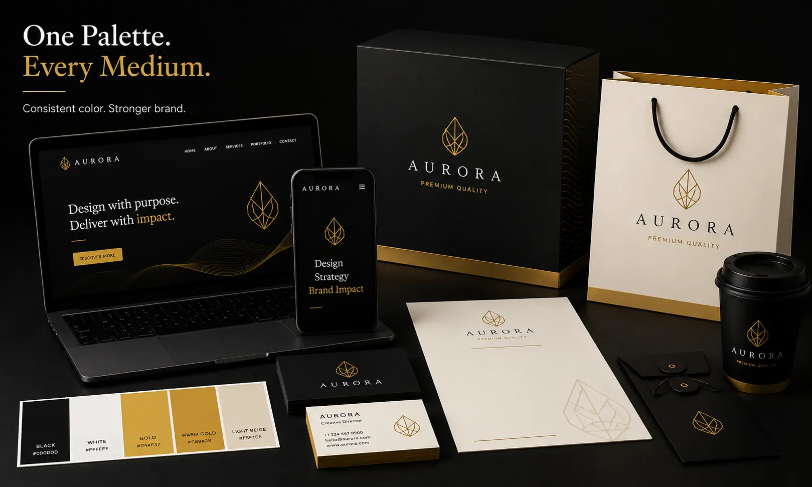
Color Consistency Requires Technical Planning
A palette is not fully defined until digital and print values have been tested. Small technical differences can become visible brand inconsistencies when they appear across packaging, signage and campaigns.
Cultural And Global Considerations
Color meaning changes across cultures, industries and regions. A color associated with celebration in one market may communicate caution, mourning or political meaning in another.
Brands entering international markets should research local interpretation rather than assuming that familiar associations are universal. This is especially important for healthcare, finance, religion, public services and products connected with cultural traditions.
A global identity may use one central palette with carefully adapted supporting colors, or it may define regional usage rules. The goal is to protect recognition without ignoring local context.
Competitor Research And Distinctiveness
Competitor analysis reveals which colors dominate the category and where opportunities for differentiation may exist. A palette that looks attractive in isolation may disappear when placed beside competing brands.
Distinctiveness should not become irrelevance. A healthcare brand using an aggressive entertainment-style palette may attract attention but reduce confidence. The strongest solutions feel appropriate enough to be understood and different enough to be remembered.
Search results, social feeds, retail shelves and app stores are useful testing environments because they show how the palette performs in competitive conditions rather than inside an isolated presentation.
Distinctiveness Is Relative
A common color can still become distinctive through a unique shade, supporting palette, proportion and usage system. Recognition depends on the complete visual pattern, not only the basic hue.
Professional Color Testing
Color should be tested in realistic applications before approval. This includes website pages, mobile interfaces, advertisements, presentations, packaging, signage, invoices and social media.
Small-Size Testing
Review icons, labels, charts and interface states at their actual size. Subtle color differences may disappear when elements become small.
Environment Testing
Test the palette on different screens, in bright light, in dark mode and on common printed materials. Real environments reveal weaknesses that polished mockups can hide.
Competitor Testing
Place the palette beside competing brands in search results, social feeds or retail contexts. The goal is to confirm both category relevance and distinctiveness.
Accessibility Testing
Check contrast, grayscale performance and common color-vision simulations. Important actions should remain understandable without relying on hue alone.
Production Testing
Print samples and packaging prototypes should be reviewed before large production runs. Materials, coatings and lighting can all alter the final appearance.
Test Decisions, Not Just Swatches
Evaluate whether the palette helps users identify buttons, understand hierarchy, recognise the brand and read comfortably. Successful testing focuses on outcomes rather than isolated color preference.
Documenting Brand Color Guidelines
Brand guidelines turn a palette into a repeatable system. They should show approved values, usage proportions, accessible combinations, prohibited combinations and examples across common applications.
Document primary, secondary, accent and neutral colors with HEX, RGB and CMYK values. Add Pantone references when production requires spot colors. Include light and dark theme variants when relevant.
Guidelines should also explain what each color is for. A marketing accent color may not be appropriate for body text. A success color should not be used decoratively if it creates confusion in a product interface.
- Record HEX and RGB values for digital use.
- Record CMYK and print references for production.
- Define primary, secondary, accent and neutral roles.
- Show approved text-and-background combinations.
- Document light and dark theme variants.
- Include logo color versions and background rules.
- Explain success, warning and error colors.
- Provide examples for websites, social media and print.
- Identify combinations that must not be used.
- Assign responsibility for future palette updates.
Brand Color Approval Checklist
Before launching a color system, complete a final review to ensure that it communicates the intended personality and performs reliably across customer touchpoints.
- The palette reflects the intended brand personality.
- The primary color is distinctive within the market.
- Secondary and accent colors have clearly defined roles.
- Neutral colors support backgrounds, text and layout structure.
- Text contrast has been tested in realistic conditions.
- Meaning is not communicated by color alone.
- The palette works in light and dark environments.
- Digital and print values have been documented.
- Physical samples have been reviewed where necessary.
- Color-vision simulations have been checked.
- The palette remains recognisable in grayscale.
- Competitor comparison confirms sufficient distinctiveness.
- Logo and icon variations work on key backgrounds.
- The system can support future products and campaigns.
- Brand guidelines explain correct and incorrect usage.
Common Brand Color Mistakes
Choosing Colors By Personal Preference
The founder's favourite color may not support the audience, category or intended personality. Brand decisions should be justified by strategy and testing.
Using Too Many Colors
An oversized palette creates inconsistency and makes recognition more difficult. Most brands benefit from a limited set of colors with clearly assigned roles.
Following Trends Without Context
A fashionable palette may quickly appear dated or become associated with many competing brands. Long-term usefulness is more important than temporary popularity.
Ignoring Contrast
Low-contrast combinations reduce readability and may exclude users. Accessibility should influence palette development from the beginning.
Using Inconsistent Shades
Small variations across websites, social posts and printed materials gradually weaken recognition. Approved values should be documented and shared with every team.
Failing To Test Production
Digital previews cannot fully predict print, packaging or signage. Physical samples should be reviewed before large-scale production.
Do Not Use Accent Colors Everywhere
An accent color loses its ability to guide attention when it appears on every element. Reserve it for high-priority actions and information.
Building Long-Term Brand Recognition
Recognition develops through consistent repetition. Customers rarely form a strong association after one interaction. The same palette must appear repeatedly across the complete brand experience.
Consistency does not mean every application must look identical. The palette can adapt to different formats while preserving the same hierarchy, primary color and neutral structure.
Frequent palette changes interrupt memory. A redesign should be considered only when the existing colors no longer support the strategy, accessibility needs, technology or market position.
Over time, a disciplined color system becomes a valuable business asset. Customers begin recognising the brand before reading the name, and new communication feels familiar because it follows the same visual language.
Consistency Builds Memory
The value of a brand color grows when the organisation repeats it consistently. Recognition is created through disciplined use, not through the color choice alone.
Frequently Asked Questions
Most brands can work effectively with one primary color, one or two supporting colors and a neutral palette. Additional functional colors may be needed for digital products, but every color should have a documented purpose.
Blue is often associated with trust and stability, but trust depends on the complete experience. Shade, typography, contrast, industry context and consistent use all influence perception.
Color psychology is useful as a starting point, but it should not replace audience research and testing. Meanings change with culture, shade, saturation, category and surrounding design elements.
The 60-30-10 rule suggests using a dominant color for roughly 60 percent of the design, a secondary color for 30 percent and an accent color for 10 percent. It is a flexible hierarchy rather than a strict mathematical requirement.
Yes. A monochromatic system can be distinctive and flexible when it includes well-planned shades, tints and neutrals. The palette still needs sufficient contrast for text, buttons and functional states.
Test important text and interface combinations for sufficient contrast, review the palette in grayscale and color-vision simulations, and make sure meaning is supported by labels, icons or structure rather than color alone.
They should be distinctive enough to support recognition, but they also need to feel appropriate for the category and audience. Differentiation can come from the exact shade, palette relationship, proportion and usage system.
Websites commonly use HEX, RGB or modern CSS color values. The brand guide should record approved digital values and accessible combinations for text, backgrounds and interactive elements.
Screens use emitted light, while printing uses ink or pigment. Paper, coating, production method and lighting can also change appearance. Print proofs are necessary when close consistency matters.
Brand colors should change only when the existing palette no longer supports the strategy, audience, accessibility needs or market position. Frequent changes weaken recognition.
Key Takeaways
A successful brand color system combines strategy, accessibility, hierarchy, production planning and consistent use.
Start With Strategy
Choose colors based on audience, positioning and business goals rather than personal taste.
Context Changes Meaning
Shade, saturation, culture and surrounding design influence how a color is interpreted.
Assign Clear Roles
Primary, secondary, accent and neutral colors should each have a defined purpose.
Protect Accessibility
Contrast and functional clarity must remain stronger than purely decorative preferences.
Test Real Applications
Review digital screens, printed samples, packaging and competitive environments.
Build Recognition Through Repetition
Consistent use turns a color palette into a memorable brand asset.
Final Thoughts
Choosing brand colors is a strategic design decision with long-term consequences. The palette influences first impressions, usability, accessibility and recognition across every customer touchpoint.
Color psychology can guide exploration, but it should never become a substitute for audience research, market context and real-world testing. Meaning comes from the complete brand system rather than from a single color in isolation.
The strongest palettes are limited, organised and documented. They define clear roles for primary, secondary, accent and neutral colors while providing accessible alternatives for text, interface states and different backgrounds.
Professional testing ensures that the palette works across phones, websites, packaging, printed materials and physical environments. Technical values should be documented so every team can reproduce the same visual identity consistently.
When strategy, hierarchy and repetition work together, brand colors become more than decoration. They become a recognisable visual language that helps customers notice, understand and remember the business.