- Why Typography Matters
- How Fonts Shape Brand Perception
- Understanding Font Anatomy
- Major Font Classifications
- Serif Vs Sans Serif
- Display And Body Fonts
- Variable Fonts
- Choosing The Right Brand Fonts
- Typography Hierarchy
- Professional Font Pairing
- Creating A Typography System
- Typography And Brand Recognition
- Typography In Digital Branding
- Responsive Typography
- Accessibility And Readability
- Web Typography And Performance
- Professional Typography Testing
- Typography Approval Checklist
- Common Typography Mistakes
- Frequently Asked Questions
- Final Thoughts
Why Typography Matters
Typography is one of the most frequently encountered elements of a brand identity. Customers may see a logo occasionally, but they interact with typography almost every time they read a website page, open an email, view an advertisement, examine packaging or use a digital product. For that reason, type is not merely a supporting design choice. It is an active part of how a brand communicates.
Every typeface carries visual characteristics that influence interpretation. Wide geometric letters can feel modern and confident. Refined serif forms may suggest heritage, expertise or luxury. Rounded letterforms can appear friendly and accessible, while condensed typography may communicate urgency, energy or efficiency. These impressions often develop before the reader has consciously processed the words.
Typography also determines how easily information can be understood. Clear letterforms, comfortable line spacing and a logical hierarchy reduce reading effort. When communication feels effortless, customers are more likely to remain engaged, understand the message and trust the organisation presenting it.
Professional typography therefore combines two responsibilities. It must express the personality of the brand while also helping people read, navigate and act. A font that looks distinctive but creates friction is not successful brand typography. The strongest systems balance identity with usability.
Customers do not experience typography as a separate design element. They experience it as the tone, confidence and clarity of the brand itself.
Typography Influences Perceived Business Value
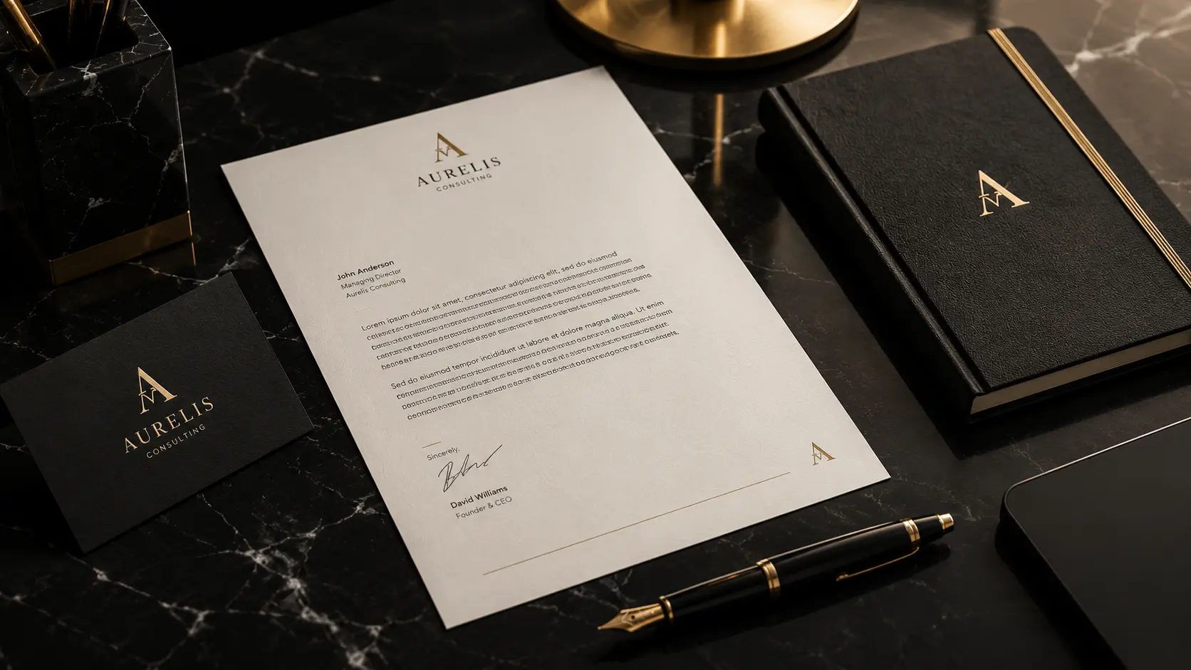
Customers often use visual quality as a shortcut for judging professionalism. When typography appears organised, readable and intentional, the business feels more established. Inconsistent or poorly spaced typography can create the opposite impression, even when the product or service itself is excellent.
How Fonts Shape Brand Perception
Fonts communicate personality through proportion, structure, contrast and rhythm. A customer may not know the name of a typeface, yet they can immediately describe how it feels. Typography can appear authoritative, playful, technical, elegant, practical, human or experimental. These emotional associations influence how people understand the positioning of a brand.
A financial organisation may benefit from typography that communicates stability and precision. A children's product may need softer forms that feel energetic and approachable. A luxury company may use generous spacing and elegant letterforms to create exclusivity, while a software platform may choose a neutral, highly readable typeface that supports clarity and speed.
The correct choice depends on more than industry convention. It should reflect the specific audience, promise and personality of the organisation. Two businesses in the same market may need different typography because they are trying to create different relationships with their customers.
A Typeface Should Reinforce Positioning
Do not begin by asking which font looks most attractive. Begin by asking which visual voice best supports the brand's strategic position. A successful typeface makes the intended personality easier to understand.
Understanding Font Anatomy
Professional font selection becomes easier when decision-makers understand how letterforms are constructed. Font anatomy describes the structural parts of letters and the invisible measurements that organise them. These details influence readability, visual personality and the way a typeface performs at different sizes.
Businesses do not need to memorise every specialist term, but a basic understanding makes typography evaluation more objective. Instead of selecting a font simply because it feels modern or stylish, teams can examine why its proportions, openings and stroke patterns make it appropriate for a particular purpose.
Baseline
The baseline is the invisible line on which most letters rest. Consistent alignment creates rhythm and stability across words, paragraphs and layouts. When text elements follow a shared baseline system, pages feel more organised even when readers cannot identify the underlying structure.
X-Height
X-height describes the height of lowercase letters such as “x”. Typefaces with generous x-heights often remain clearer at smaller digital sizes because the main body of each character is more visible. A larger x-height can improve interface readability, although it also changes the visual personality and density of the typeface.
Ascenders And Descenders
Ascenders extend above the main height of lowercase letters, while descenders move below the baseline. These elements help readers distinguish word shapes. When they are overly compressed, paragraphs may feel crowded. Balanced ascenders and descenders create openness and improve recognition during continuous reading.
Counters And Apertures
Counters are enclosed spaces inside letters such as “o”, “d” and “p”. Apertures are partially open spaces found in letters such as “c”, “e” and “s”. Clear internal spaces help characters remain distinguishable on small screens, under poor lighting and at reduced resolutions.
Stroke Contrast
Stroke contrast refers to the difference between thick and thin parts of a letter. High-contrast typography may communicate refinement and sophistication, but very thin strokes can disappear at small sizes. Low-contrast typefaces are often more robust for interfaces and extended reading.
Serifs, Terminals And Stems
Stems are the primary vertical or diagonal strokes that form a character. Serifs are the smaller finishing strokes attached to certain letterforms, while terminals describe the ending shape of strokes that do not use a serif. These details strongly influence whether typography feels traditional, modern, formal or expressive.
Evaluate Words, Not Isolated Letters
A beautiful individual character does not guarantee a readable typeface. Test complete headlines, paragraphs, numbers, punctuation and real brand language before approving any font.
Major Font Classifications
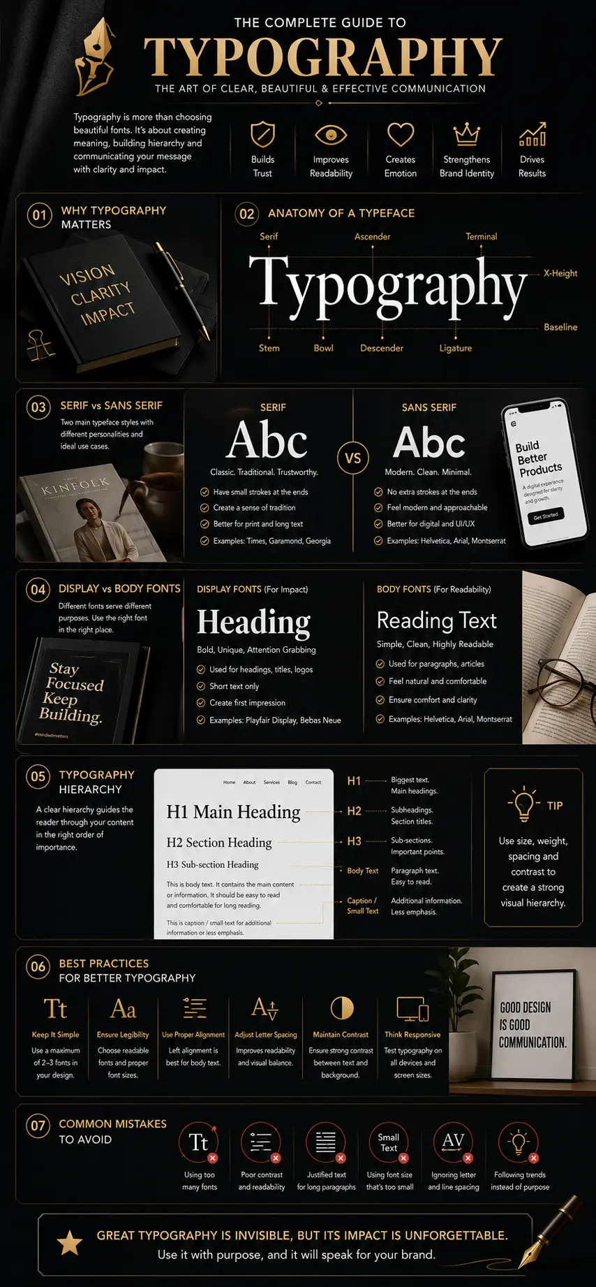
Font classifications help designers understand the broad visual families available for brand communication. Each category contains thousands of individual typefaces, but the shared structural characteristics provide a useful starting point when deciding which personality and performance qualities a brand requires.
Serif Fonts
Serif fonts include finishing strokes at the ends of many letterforms. They are frequently associated with publishing, heritage, expertise, law, finance and premium products. Their long history in books and editorial design gives them a familiar and authoritative character.
Serif typography can feel elegant and trustworthy, but not every serif typeface is formal. Some appear warm and literary, others sharp and luxurious, while slab serifs can feel bold, practical and industrial.
Sans Serif Fonts
Sans serif fonts remove the finishing strokes found in serif typography. Their cleaner forms are widely used in technology, digital products, modern retail and contemporary corporate identities. Many offer excellent clarity on screens because their letterforms remain simple at reduced sizes.
The category is extremely diverse. Geometric sans serifs can appear structured and modern. Humanist sans serifs often feel warmer and more natural. Grotesque styles may communicate neutrality, efficiency or confidence.
Display Fonts
Display fonts are created for visual impact rather than extended reading. Their distinctive shapes can make headlines, campaigns and packaging more memorable. Because they carry a strong personality, they should usually be reserved for shorter text where expression is more important than reading speed.
Script And Handwritten Fonts
Script and handwritten typefaces imitate calligraphy, lettering or natural handwriting. They can communicate craftsmanship, personality, intimacy or celebration. Their decorative qualities require restraint because complex scripts often lose clarity at small sizes.
Monospaced Fonts
Monospaced typefaces give every character the same horizontal width. They originated in mechanical and technical environments and are now strongly associated with coding, data, engineering and systems thinking. Used carefully, they can add a precise or technical quality to a brand.
Classification Does Not Determine Quality
No font category is automatically more professional than another. Quality depends on whether the typeface supports the brand, remains readable and performs consistently in its intended applications.
Serif Vs Sans Serif For Branding
The choice between serif and sans serif typography is one of the most common branding decisions, but it should not be reduced to a simple rule such as “serif is traditional” and “sans serif is modern.” Both categories contain a wide range of personalities, and both can support professional identities when selected with purpose.
Serif typography often performs well when a brand wants to communicate knowledge, heritage, editorial authority or refined craftsmanship. Sans serif typography is frequently effective when clarity, simplicity, technology or accessibility are central to the customer experience.
Many successful systems use both categories. A serif display face may provide personality in headlines while a neutral sans serif supports body text and interfaces. The combination works when the two typefaces create contrast without appearing disconnected.
Serif And Sans Serif Comparison
| Serif Typography | Sans Serif Typography |
|---|---|
| Contains finishing strokes that add detail and rhythm to letterforms. | Uses cleaner letter endings without traditional serif strokes. |
| Often associated with heritage, publishing, expertise and premium positioning. | Often associated with modernity, clarity, technology and accessibility. |
| Can provide a distinctive editorial voice in headlines and printed materials. | Frequently performs well in interfaces, navigation and smaller digital text. |
| High-contrast styles may require careful testing at small sizes. | Simple structures often remain stable across varied resolutions and devices. |
| Useful for law, finance, luxury, education, culture and publishing. | Useful for technology, healthcare, retail, startups, SaaS and digital products. |
Do Not Choose A Category By Stereotype Alone
Not every luxury brand needs a serif, and not every technology company needs a geometric sans serif. Test the actual typeface against the brand's audience, message and practical applications rather than relying on general category assumptions.
The best brand font is not the one that follows the category rule. It is the one that communicates the right personality while remaining useful everywhere the brand appears.
Display And Body Fonts
Different typographic roles require different levels of expression. A headline may need personality, contrast and visual impact, while body text must remain calm, readable and comfortable over longer passages. Treating every piece of text with the same font style usually weakens hierarchy and makes communication more difficult to scan.
Display fonts are designed to attract attention. Their unusual proportions, decorative details or expressive letterforms can help campaigns, packaging and major headings feel distinctive. They work best when used in short phrases where readers can recognise the message quickly.
Body fonts have a different responsibility. They must support sustained reading across paragraphs, product descriptions, articles, interfaces and reports. Clear counters, balanced spacing and dependable rendering are more important than visual novelty.
A professional typography system often combines one expressive display face with one highly readable body face. The contrast creates hierarchy while maintaining consistency across the complete brand system.
Display Fonts And Body Fonts
| Display Fonts | Body Fonts |
|---|---|
| Designed to create impact and attract attention quickly. | Designed to support comfortable reading over longer passages. |
| Best for headlines, campaigns, packaging, posters and short statements. | Best for articles, websites, reports, interfaces and supporting information. |
| May use decorative details, unusual proportions or stronger personality. | Usually uses balanced forms, clear spacing and predictable rhythm. |
| Should be used sparingly to preserve its distinctiveness. | Can appear repeatedly without creating visual fatigue. |
| Prioritises expression and memorability. | Prioritises clarity, legibility and reading comfort. |
Test The Pairing With Real Content
Do not judge a display-and-body combination using only the alphabet or placeholder text. Test the actual brand name, common headlines, paragraph lengths, numbers, buttons and calls to action before approving the pairing.
Variable Fonts And Flexible Brand Systems
Variable fonts combine multiple weights, widths or styles inside a single font file. Instead of loading separate files for Light, Regular, Medium, Bold and Extra Bold, a website can use one flexible file that moves continuously between these values.
This creates practical benefits for modern branding. Designers gain more precise control over hierarchy, while developers may reduce the number of font resources required by a website. A heading can become heavier on a large screen, narrower inside limited space or slightly lighter on mobile without switching to a completely different typeface.
Variable fonts also support more responsive systems. Typography can adapt smoothly as the viewport changes rather than jumping between a small collection of fixed values. This flexibility is especially useful for brands that operate across websites, mobile applications, dashboards and digital products.
However, flexibility should not become complexity. A variable font may offer hundreds of possible combinations, but a brand should still define a controlled set of approved styles. Consistency depends on rules, not unlimited options.
Flexibility Reduces Future Redesign Pressure
A well-selected variable font can support new devices, screen sizes and product interfaces without forcing the brand to adopt an entirely new typography system. This makes it valuable for organisations planning long-term digital growth.
Do Not Load Every Possible Axis Without Testing
Variable font files can still become heavy when they contain unnecessary character sets or design axes. Test file size, rendering quality and browser support before introducing them into a production website.
Choosing The Right Brand Fonts
Font selection should begin with strategy rather than personal taste. The first question is not “Which font looks best?” but “What should this brand communicate?” A typeface must support positioning, customer expectations, practical requirements and long-term consistency.
Begin by defining the personality the organisation wants to express. A dependable financial service may require precision and calm authority. A creative studio may need greater individuality. A healthcare brand may value clarity, warmth and accessibility, while a premium hospitality company may use refined details and generous spacing to create exclusivity.
Audience expectations also matter. Typography that feels appropriate for an experimental fashion label may be unsuitable for a legal practice. At the same time, relying too heavily on industry conventions can make the brand indistinguishable from competitors. The goal is to create relevance without losing distinctiveness.
Practical performance must be considered from the beginning. The chosen fonts should contain the required weights, symbols, language characters and licensing permissions. They must also remain readable in the smallest and largest situations the brand expects to use.
Define The Brand
Clarify personality, audience, positioning and communication goals.
Create A Shortlist
Select typefaces that satisfy both personality and practical requirements.
Test Real Content
Review headlines, paragraphs, buttons, numbers and customer-facing messages.
Document The System
Define approved styles, spacing, weights, sizes and usage rules.
The Right Font Must Work Beyond The Logo
A typeface should be evaluated across complete customer journeys. Test it on navigation, product pages, email campaigns, presentations, social media graphics, packaging and printed documents before making the final decision.
Typography Hierarchy
Typography hierarchy organises information by showing readers what deserves attention first, what provides supporting detail and what should be read as secondary information. Without hierarchy, even excellent content can feel dense and difficult to navigate.
A strong hierarchy uses differences in size, weight, spacing, colour and placement to create clear levels of importance. The largest text does not always need to be the most decorative. Its primary purpose is to establish the first point of attention and prepare the reader for what follows.
Headings should create predictable structure. An H1 identifies the central topic. H2 headings divide the article into major sections, while H3 headings introduce smaller ideas within those sections. Body text delivers the main explanation, and captions or labels provide supporting context.
Consistency is essential. If the same visual style represents different levels on different pages, readers must repeatedly relearn the structure. A documented hierarchy reduces that effort and helps every brand touchpoint feel connected.
Good hierarchy does not decorate information. It reveals the order in which information should be understood.
Typical Typography Roles
| Typography Role | Primary Purpose |
|---|---|
| H1 / Main Heading | Introduces the central subject and creates the strongest visual entry point. |
| H2 / Section Heading | Divides long content into clear and meaningful sections. |
| H3 / Subheading | Organises smaller ideas and improves scanning within a section. |
| Body Text | Delivers detailed information with maximum reading comfort. |
| Caption / Supporting Text | Provides context, labels, references or secondary information. |
Spacing Is Part Of Hierarchy
A heading becomes easier to understand when the space above and below it clearly connects the heading to the correct section. Hierarchy depends on spacing relationships as much as font size.
Professional Font Pairing
Font pairing combines two or more typefaces to create contrast, hierarchy and personality. Successful pairings make each font easier to understand by giving it a clear role. Unsuccessful pairings compete for attention or appear so similar that the combination provides no useful distinction.
The simplest approach is to use one family with multiple weights. This produces a highly consistent system and reduces technical complexity. When a second typeface is introduced, it should contribute a quality the first font cannot provide, such as stronger display personality or more comfortable long-form reading.
Contrast should be intentional. Pairing a serif headline with a sans serif body font creates structural contrast. Combining a narrow display face with a wider reading face creates proportional contrast. Differences in weight, width and rhythm can also establish separation without making the system feel disconnected.
Harmony remains equally important. The typefaces may differ, but their proportions, x-height, tone or historical character should still feel compatible. The best combinations create clear distinction while appearing to belong to the same visual world.
Begin With Two Roles
Start with one typeface for headlines and one for body content. Add another font only when a genuine communication requirement cannot be solved through weight, size or spacing.
Similar Fonts Can Create Accidental Inconsistency
Two typefaces that look almost identical may appear like an implementation error rather than an intentional pairing. Create enough contrast for readers to understand that each font has a distinct role.
Creating A Typography System
A typography system defines how type should be used across every brand application. Instead of choosing sizes and weights separately for each project, the organisation creates a repeatable framework that supports consistency, efficiency and collaboration.
The system should identify the primary and secondary typefaces, approved font weights, heading levels, body styles, captions, labels, button text and responsive behaviour. It should also explain how line height, letter spacing and paragraph width change across different environments.
Documentation becomes especially important as the organisation grows. Designers, developers, marketers and external partners may all create brand materials. Without shared rules, each person makes slightly different typography decisions, gradually weakening recognition.
- Define the primary brand typeface.
- Choose a secondary typeface only when it serves a clear role.
- Create consistent H1, H2 and H3 styles.
- Define body text sizes and line-height standards.
- Specify approved font weights and emphasis styles.
- Document captions, labels and button typography.
- Set responsive behaviour for phone, tablet and desktop.
- Record accessibility and contrast requirements.
Systems Reduce Repeated Decisions
A documented typography system saves time because teams no longer need to redesign hierarchy for every page, presentation or campaign. The system protects consistency while allowing content production to move faster.
Typography And Brand Recognition
Typography becomes recognisable through repetition. Customers may not remember the name of a font, but they begin to recognise its proportions, spacing, headline treatment and overall rhythm. These patterns become part of the brand's visual signature.
Recognition grows when typography remains consistent across repeated interactions. The same visual voice should appear on websites, advertisements, packaging, presentations, email campaigns and social media. Each touchpoint reinforces the relationship between the typographic style and the organisation.
Typography can sometimes communicate identity even when the logo is absent. A distinctive headline style, consistent use of spacing or recognisable type pairing may be enough for customers to associate the content with the brand.
This is why changing typography frequently can weaken memory. A redesign may improve appearance, but it also interrupts familiar patterns. Changes should be introduced only when the current system no longer supports the strategy, technology or practical needs of the organisation.
Consistency Turns Typography Into An Asset
A typeface becomes valuable when the brand uses it consistently enough for customers to form an association. Repetition transforms typography from a design choice into a recognisable business asset.
Typography In Digital Branding
Digital typography must perform inside changing environments. Text appears on phones, tablets, laptops, large monitors, dashboards, emails and interactive products. Each context introduces different dimensions, resolutions and reading behaviours.
A digital typeface should remain clear at smaller sizes and maintain distinction between similar characters. Letters such as “I”, “l” and “1” should not become confusing. Counters and apertures should remain open, and punctuation should be easy to identify.
Interface typography must also support action. Navigation labels, buttons, form instructions and error messages should be immediately understandable. Decorative choices that work in campaign headlines may create friction when used inside functional interface elements.
Good digital typography helps users complete tasks with less effort. Clear structure, dependable rendering and predictable hierarchy make the interface feel faster and more trustworthy.
Responsive Typography
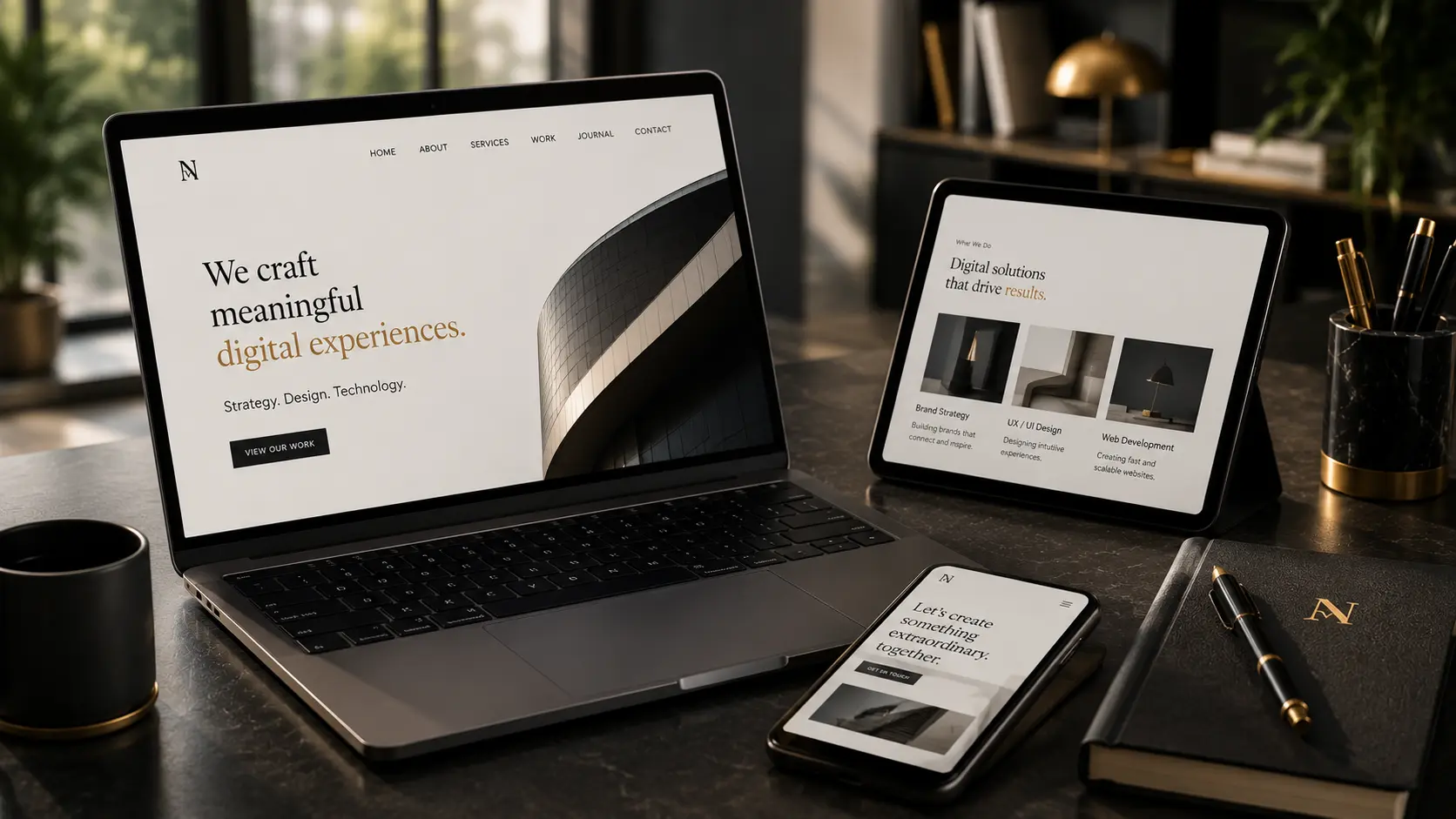
Responsive typography adapts to the available screen rather than simply shrinking desktop text. Headings, line lengths, spacing and proportions should change together so that the reading experience remains comfortable on every device.
A large desktop heading may create impact because it has sufficient surrounding space. The same size on a phone could dominate the screen and push useful content below the fold. Reducing the font size alone may not solve the problem if line height, margins and paragraph width remain unchanged.
Modern CSS allows typography to scale fluidly between minimum and maximum values. This creates smoother transitions across devices while preventing text from becoming excessively small or large. Responsive systems should also adjust the number of columns, alignment and surrounding whitespace.
The goal is not identical appearance. The goal is a consistent reading experience. The visual personality should remain recognisable even when the layout changes significantly.
Responsive Typography By Viewport
| Large Screens | Small Screens |
|---|---|
| Larger headings can use more dramatic scale and wider spacing. | Headings should remain strong without consuming the entire viewport. |
| Longer line lengths may work when content columns remain controlled. | Shorter line lengths reduce eye movement and improve reading comfort. |
| Multi-column layouts can create structured editorial experiences. | Single-column layouts usually provide clearer reading flow. |
| More whitespace can support hierarchy and premium positioning. | Spacing should remain generous but efficient within limited space. |
| Desktop navigation can display more labels and supporting information. | Navigation and controls should prioritise essential actions. |
Test typography at the narrowest and widest supported viewports, not only at common device presets. Layout problems frequently appear between standard breakpoint sizes.
Accessibility And Readability
Accessible typography helps more people understand and use brand communication. It benefits users with visual impairments, reading difficulties, temporary injuries, poor displays, bright outdoor environments and slow-loading devices. Clear typography improves the experience for everyone.
Font size is only one accessibility factor. Contrast, line height, paragraph width, letter spacing and visual hierarchy all influence reading comfort. Text may technically meet a minimum size while still feeling difficult to read because the lines are too long or the spacing is too compressed.
Colour should never be the only way to communicate meaning. Links, warnings and interface states should use additional indicators such as underlines, icons, labels or structural changes. Typography must remain understandable in both light and dark themes.
Businesses should also consider language support. A font that works beautifully in English may not contain the characters required for international markets. Missing accents, symbols or scripts can create inconsistent fallback typography and weaken the customer experience.
Thin Text Can Disappear In Real Conditions
Very light font weights may look elegant on a high-resolution design monitor but become difficult to read on cheaper screens, mobile devices, projectors or printed materials. Always test outside the ideal design environment.
Web Typography And Website Performance
Typography affects website performance because every font file must be downloaded, processed and rendered by the browser. Loading multiple families, weights and language sets can significantly increase page size and delay the moment when visitors can begin reading.
A disciplined typography system usually performs better than an oversized collection of fonts. Load only the weights and styles that the website genuinely uses. If Regular, Medium and Bold cover the complete interface, there is little benefit in downloading six additional weights.
Font display behaviour also matters. When a web font loads slowly, the browser may temporarily show a fallback typeface. If the fallback has different proportions, text can shift when the final font appears. These layout movements interrupt reading and create an unstable experience.
Performance optimisation should include efficient file formats, selective character sets, sensible preloading and carefully chosen fallbacks. Variable fonts may reduce requests, but their total file size should still be measured.
A Faster Font System Feels More Professional
Visitors may never know why a page feels smooth or unstable, but they experience the result immediately. Fast, predictable font loading supports trust because the website appears ready, organised and dependable.
Traditional Font Families And Variable Fonts
| Traditional Font Files | Variable Font Files |
|---|---|
| Each weight or style is usually stored in a separate file. | Multiple weights or styles may be included inside one flexible file. |
| Simple to control when only a few fixed styles are required. | Useful when typography needs continuous responsive variation. |
| Additional weights increase the number of font requests. | One file may reduce requests but can still be large. |
| Works reliably across mature browser and design workflows. | Provides greater design precision in modern environments. |
| Best when the system uses a limited set of approved styles. | Best when flexibility and responsive behaviour provide real value. |
Professional Typography Testing
Typography should never be approved only because it looks attractive inside a design application. Professional testing examines how the system behaves in realistic situations, including websites, mobile interfaces, printed documents, presentations, packaging and advertising.
Testing often reveals problems that are invisible during the initial design stage. A heading may look balanced on a large monitor but become awkward when wrapped across several lines on a phone. A light font weight may appear refined on screen but disappear during printing. Closely spaced letters may feel elegant in a logo while becoming difficult to read in navigation or body text.
The most reliable evaluation uses real content instead of placeholder text. Brand names, product titles, prices, numbers, dates, customer messages and multilingual words should all be tested. These examples reveal whether the selected typeface contains the characters and flexibility required by the organisation.
Cross-Device Testing
Review typography on phones, tablets, laptops and larger monitors. Each device changes line length, resolution, viewing distance and available space. A successful system preserves hierarchy and readability while adapting its scale and spacing.
Browser And Operating-System Testing
Fonts may render differently across browsers and operating systems. Small differences in weight, spacing and smoothing can affect the final appearance. Testing should include the environments most commonly used by the intended audience.
Print Proofing
Digital previews cannot fully predict printed results. Paper texture, ink behaviour, production methods and viewing distance may change how thin strokes, small text and colour contrast appear. Sample prints help identify problems before large production runs begin.
Light And Dark Theme Testing
Typography should remain clear in both light and dark environments. Dark themes often require slightly different weights, contrast relationships or spacing because bright text on a dark background can appear visually heavier.
Performance Testing
Measure how quickly font resources load and whether text shifts during rendering. A visually successful typeface can still damage the experience when it delays content or causes unstable layouts.
Test Typography Before Building The Complete Identity
Evaluate a small but realistic set of applications early in the project. Finding weaknesses before final production is faster and less expensive than correcting typography after websites, packaging and campaigns have already been created.

Typography Approval Checklist
Before a typography system becomes part of the public brand identity, it should pass a final practical review. This process confirms that the selected typefaces communicate the intended personality while performing reliably across every important application.
- Typography accurately reflects the intended brand personality.
- Headlines remain distinctive without reducing readability.
- Body text can be read comfortably over longer passages.
- Only necessary font families and weights are included.
- The typefaces contain all required characters, numbers and symbols.
- Commercial and webfont licensing requirements have been confirmed.
- Typography works consistently on phone, tablet and desktop screens.
- Light and dark theme contrast has been reviewed.
- Line height and paragraph width support comfortable reading.
- Print proofs remain clear at both small and large sizes.
- Website loading and layout stability have been tested.
- Heading, body, caption and interface styles are documented.
- Typography remains consistent across marketing and product channels.
- Fallback fonts preserve similar proportions when web fonts are unavailable.
- Accessibility requirements have been tested in realistic conditions.
Typography is ready for launch only when it communicates the correct personality, supports comfortable reading and performs consistently everywhere customers encounter the brand.
Common Typography Mistakes
Typography problems often begin when visual preference becomes more important than communication. A typeface may look impressive in isolation while creating inconsistency, poor readability or technical problems once it is introduced across a complete brand system.
Using Too Many Typefaces
Every additional font introduces a new visual voice. When several unrelated typefaces appear across the same identity, the brand begins to feel fragmented. Most organisations can create sufficient variety through size, weight and spacing without continually introducing new fonts.
Choosing A Font Because It Is Trending
Popular typography can provide inspiration, but trends should not replace strategy. A fashionable typeface may quickly become associated with a particular period or appear across too many competing brands. Long-term identity requires stronger reasoning than temporary popularity.
Ignoring Licensing
Fonts are intellectual property. A licence that allows personal desktop use may not permit commercial branding, web embedding, applications, advertising or distribution to external partners. Confirm the licence before the typeface becomes difficult to replace.
Using Decorative Fonts For Body Text
Display typography is created to attract attention, not necessarily to support long reading. When decorative letterforms appear in paragraphs, users must work harder to recognise words and maintain concentration.
Relying On Font Size Alone
Increasing the size does not automatically improve readability. Line length, contrast, weight, spacing and letterform clarity are equally important. A large paragraph can still be uncomfortable when it stretches too widely across the page.
Forgetting Real Content
Placeholder text cannot reveal every problem. Real content may include long product names, unusual numbers, punctuation, currency symbols or translated language. Typography must accommodate the actual communication needs of the brand.
Inconsistent Implementation
Even a strong typography system can fail when teams interpret the rules differently. Unapproved weights, random sizes and inconsistent spacing gradually weaken recognition. Clear brand guidelines are essential for protecting the system.
Do Not Confuse Variety With Hierarchy
A page does not need a different font for every information level. Strong hierarchy can usually be created through size, weight, spacing and placement while keeping the number of typefaces limited.
The strongest typography systems create variety through disciplined rules, not through an unlimited collection of fonts.
Frequently Asked Questions
Most brands can build an effective system with one or two typeface families. A single flexible family may provide enough variety through different weights and styles. A second font should be introduced only when it performs a clear supporting role.
The correct choice depends on the brand's personality, audience and practical applications. Serif fonts can communicate heritage or editorial character, while sans serif fonts often support clarity and modern digital experiences. Neither category is automatically better.
Yes. Combining a serif and sans serif can create useful contrast between headlines and body text. The pairing should still feel visually compatible, and each typeface should have a clearly documented role.
Body fonts should have clear letterforms, open counters, comfortable spacing and reliable rendering at smaller sizes. They should remain easy to read across longer paragraphs without creating visual fatigue.
Variable fonts can reduce separate file requests and provide flexible responsive control, but they are not automatically faster. Their total file size, character support and browser performance should still be measured before implementation.
Yes. Repeated use of the same typefaces, hierarchy and spacing creates familiar visual patterns. Over time, customers may recognise the typography style even when the logo is not prominently displayed.
Font licensing is essential. Different licences may be required for desktop design, websites, applications, advertising, broadcasting or product embedding. Businesses should verify permissions before publicly using a font.
Legibility describes how easily individual characters can be distinguished. Readability describes how comfortably complete words, sentences and paragraphs can be consumed. Effective typography requires both.
A disciplined font system can improve performance by limiting unnecessary families and weights, using efficient file formats and reducing layout shifts. Typography should be considered during performance planning rather than added after development.
Mobile typography often uses smaller headings, but body text should remain comfortably readable. Responsive design also adjusts line height, spacing, margins and content width rather than reducing every font size proportionally.
Typography should change only when the current system no longer supports the brand strategy, audience, technology or practical requirements. Frequent changes weaken recognition and create additional implementation costs.
AI can suggest typefaces and accelerate exploration, but final selection still requires strategic judgement, licensing review, accessibility testing and evaluation across real brand applications.
Key Takeaways
A professional typography system combines personality, readability, consistency and technical performance.
Typography Creates A Visual Voice
Font structure, weight and spacing influence how customers interpret the personality of a brand.
Readability Comes First
A distinctive typeface has little value when customers struggle to read the information it presents.
Use A Limited System
One or two carefully selected families usually provide enough flexibility for a complete identity.
Build Clear Hierarchy
Size, weight and spacing should guide readers through information in a predictable order.
Test Real Applications
Evaluate typography on devices, websites, printed materials, packaging and customer-facing content.
Document Every Rule
Shared guidelines protect consistency as more people create content for the brand.
Final Thoughts
Typography is one of the most powerful and frequently encountered elements of brand identity. It shapes the tone of communication, organises information and influences whether customers perceive a business as trustworthy, modern, premium, approachable or professional.
Successful typography begins with strategy. The selected fonts should reflect the brand's positioning and audience while remaining practical across websites, products, packaging, presentations and printed materials. Visual personality and usability must work together.
The strongest systems are usually disciplined rather than complicated. They use a limited number of typefaces, create predictable hierarchy and document clear rules for weights, spacing and responsive behaviour. This structure makes communication easier to produce and more consistent to experience.
Typography should also be tested beyond ideal design conditions. Different devices, browsers, lighting environments, languages and printing methods may reveal weaknesses that are not visible inside a controlled mockup. Professional testing protects both readability and recognition.
When typography is selected carefully and implemented consistently, it becomes more than a collection of fonts. It becomes a recognisable visual voice that helps customers understand, remember and trust the brand.