- What Logo Psychology Actually Means
- How The Brain Processes A Logo
- Processing Fluency
- Distinctiveness vs Familiarity
- Complexity Changes With Repetition
- Shape Psychology
- Gestalt Principles And Perception
- The Mere-Exposure Effect
- Meaning And Semantic Congruence
- How Logos Support Trust
- Color As A Contextual Cue
- Typography As Brand Voice
- How Emotional Meaning Is Learned
- How To Test Logo Memory
- Common Psychology Mistakes
- Psychology-Based Evaluation Checklist
- Frequently Asked Questions
- Final Thoughts
What Logo Psychology Actually Means
A logo becomes memorable when it gives the brain a clear visual cue that can be processed quickly, distinguished from competing marks, connected to relevant meaning and retrieved after repeated exposure. No single color, shape or font creates that result on its own. Memorability emerges from the relationship between visual form, business context and the experiences people repeatedly associate with the brand.
Logo psychology is the study of those relationships. It asks how people notice a mark, how easily they make sense of it, what expectations it activates and whether they can recognize it later. This is different from asking whether a logo looks attractive. A visually impressive mark can still fail if customers confuse it with a competitor, misunderstand what it represents or cannot retrieve it from memory.
The practical goal is not to manipulate people. It is to reduce unnecessary mental friction while giving the brand a distinctive cue it can consistently own. That cue might be a silhouette, a letterform, a proportion, a symbol or an unusual relationship between elements. It becomes valuable only when the business uses it coherently and delivers experiences that reinforce its meaning.
Why Are Some Logos More Memorable Than Others?
Memorable logos balance four jobs: they attract enough attention to be noticed, remain simple enough to process, contain a distinctive feature that separates them from alternatives and appear consistently enough to build familiarity. If one job fails, recognition becomes harder.
How The Brain Processes A Logo
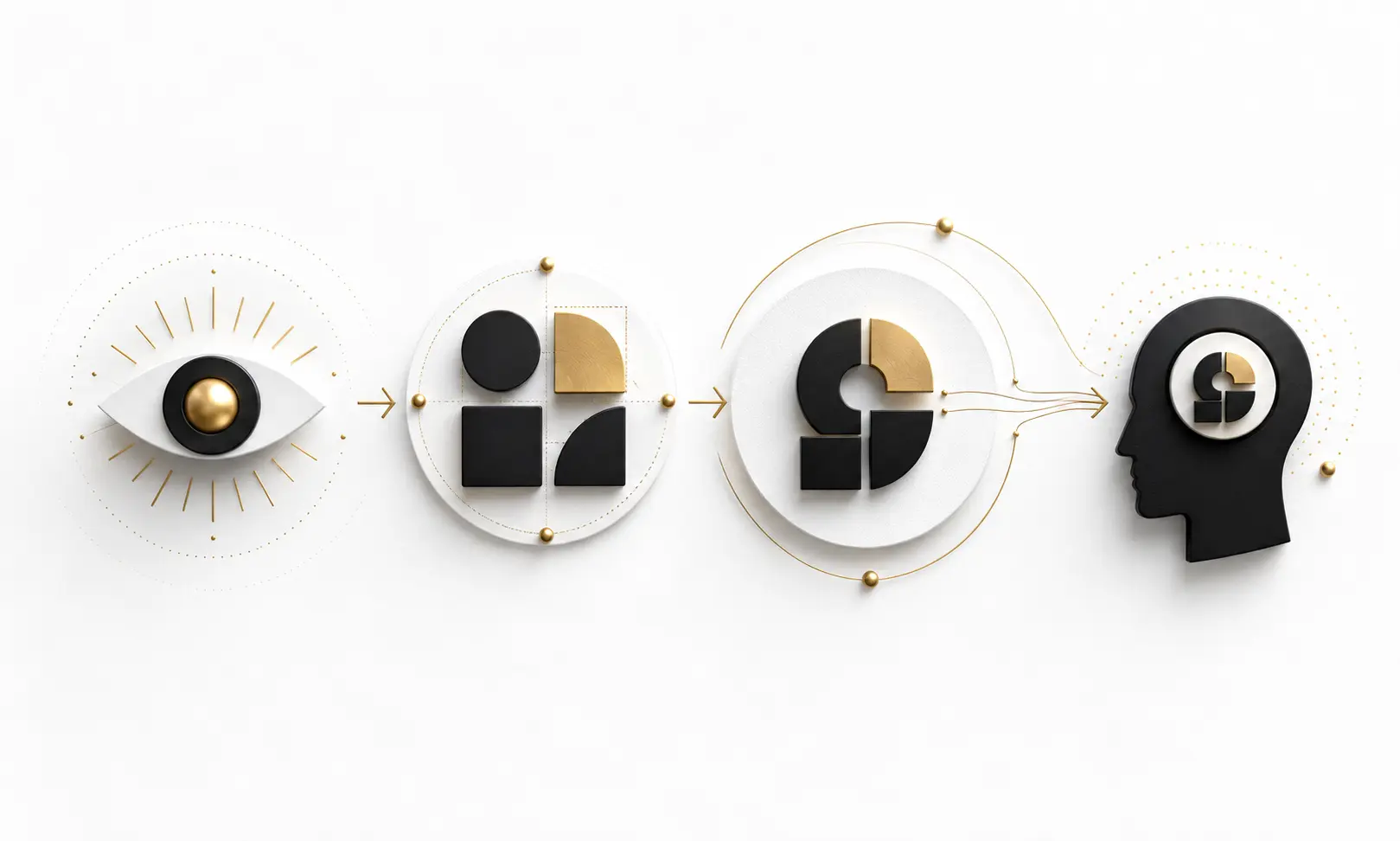
People do not experience a logo as a checklist of colors, curves and letters. Perception begins by organizing the overall visual pattern. The viewer notices contrast and form, groups related elements, compares the mark with familiar categories and then assigns meaning using the surrounding context. Only after these stages can the logo become a useful memory cue.
This process explains why recognition and recall are different. Recognition happens when someone sees a mark and identifies it as familiar. Recall is more demanding because the person must retrieve the mark without seeing it. A customer may recognize a logo on packaging yet be unable to draw it accurately. Both outcomes matter, but they should be tested separately.
Notice
Contrast, scale and placement make the mark available to attention.
Organize
The visual system groups shapes, edges, letters and empty space into one pattern.
Interpret
Context and prior knowledge help the viewer infer category, personality and meaning.
Retrieve
Repeated, consistent exposure strengthens the cue so it can be recognized later.
Processing Fluency: Why Easier Often Feels Better
Processing fluency describes how easily the mind handles information. A logo can feel fluent when its form is clear, its elements are organized and its meaning can be understood without unnecessary effort. Fluent processing often creates a sense of familiarity or confidence, even when the viewer cannot explain exactly why the mark feels comfortable.
Ease, however, is not the same as blandness. A generic mark may be easy to process because it resembles hundreds of existing logos, but that same familiarity can make it difficult to attribute to one company. The most useful form of fluency preserves clarity while retaining a feature the brand can own.
Research by Chris Janiszewski and Tom Meyvis examined how logo complexity, repetition and spacing interact with processing fluency. Their work is especially useful because it shows that exposure is not a simple formula in which every repetition automatically improves evaluation. The characteristics of the mark and the pattern of exposure influence how fluency develops. See the Journal of Consumer Research study.
The best psychological advantage is not making a logo effortless to ignore. It is making the right distinctive idea effortless to recognize.
Distinctiveness vs Familiarity: The Balance That Builds Recognition
Familiar visual patterns help people understand what they are looking at. A banking mark may need to feel stable; a children's product may need to feel approachable; an engineering company may need to communicate precision. Category cues can reduce uncertainty, but copying the visual language of every competitor produces sameness rather than trust.
Distinctiveness gives memory something specific to hold. It does not require visual noise or deliberate strangeness. A modest but consistent cue—a characteristic cut in a letter, an unusual proportion, a recognizable container shape or a unique relationship between symbol and wordmark—can be more useful than an elaborate illustration.
Fluent But Generic vs Fluent And Distinctive
| Fluent But Generic | Fluent And Distinctive |
|---|---|
| Easy to understand, difficult to attribute | Easy to understand and linked to one brand |
| Uses familiar category symbols without a unique cue | Uses category relevance with a proprietary visual decision |
| Looks acceptable beside competitors | Remains recognizable when competitors are present |
| Depends on the company name for identification | Builds recognition through form as well as name |
| May test well for immediate liking | Is tested for both immediate clarity and later memory |
Why Complexity Changes With Repetition
Complexity is not one single property. Visual complexity refers to how much perceptual detail the viewer must organize. Conceptual complexity refers to how much interpretation is required to understand the idea. A mark can be visually simple but conceptually ambiguous, or visually detailed but conceptually obvious.
This distinction matters because first exposure and repeated exposure do not create identical responses. An unusual idea may initially require more interpretation but become rewarding once understood. In contrast, decorative detail may attract attention at first and become tiring when repeated across hundreds of brand interactions.
Research on visual and conceptual dimensions in logo evaluation suggests that the effect of complexity can change across exposures. That makes a strong case for testing logos more than once and separating immediate preference from developing recognition. The accepted research paper is available through City Research Online.
Do Not Turn Psychology Into A Formula
A rule such as "simple always wins" removes the role of audience, exposure and meaning. The better question is whether each element helps recognition, interpretation or distinctiveness—and whether the complete mark still works after repeated use.
Shape Psychology: Curves, Angles And Expectations
Shapes can activate expectations before a person reads the brand name. Rounded forms may suggest softness, continuity or approachability in some contexts, while angular forms may suggest hardness, precision or energy. These are tendencies rather than fixed translations. The same circle can represent community, motion, protection or a technical component depending on the category and surrounding design.
A series of experiments by Yuwei Jiang, Gerald Gorn, Maria Galli and Amitava Chattopadhyay found that circular and angular logo shapes could influence judgments about product or company attributes. The practical lesson is not that every friendly brand needs a circle. It is that geometry can prime expectations, so the chosen form should support the experience the business can actually deliver. Read the published study.
Shape Meaning Is Relational
Viewers do not interpret geometry in isolation. They combine the shape with the company name, category, typography, color, product experience and cultural context. That is why copying a shape from a successful brand does not copy the meaning attached to it.
Gestalt Principles And The Way People Organize A Mark
The visual system naturally looks for structure. Elements placed close together are likely to be perceived as a group. Similar shapes appear related. Continuous lines encourage the eye to follow a path, and incomplete forms may be mentally completed when enough information is present. Designers commonly describe these tendencies through Gestalt principles such as proximity, similarity, continuity, closure and figure-ground.
These principles help explain why spacing and negative space affect comprehension. If unrelated elements appear too close, the viewer may group them incorrectly. If parts that belong together are separated, the mark can feel fragmented. If figure and background compete, the viewer may struggle to identify the primary form.
The goal is not to hide a puzzle inside every logo. Cleverness is useful only when the primary mark remains clear. A secondary interpretation can reward attention, but it should never prevent the viewer from recognizing the brand's basic visual cue.
Familiarity And The Mere-Exposure Effect
Repeated exposure can make a stimulus feel easier to process and more familiar. For brands, this means recognition is built through consistent encounters rather than one dramatic launch. A logo seen on a website, package, invoice, profile image and physical sign can become a reliable cue when its essential form remains stable.
Repetition cannot rescue a confusing identity by itself. It strengthens whatever is being repeated. If customers repeatedly see inconsistent versions, recognition becomes divided among competing cues. If they repeatedly experience poor service beneath the same mark, the logo can become a powerful reminder of disappointment.
Familiarity therefore works with experience, not instead of it. The visual system makes the brand easier to retrieve; the business decides whether the retrieved association is positive, neutral or negative. For the operational side of keeping cues stable, see Why Brand Consistency Matters.
Consistency makes a logo easier to retrieve. Customer experience determines what that retrieval means.
Meaning And Semantic Congruence
Semantic congruence describes how well a visual cue fits the ideas activated by the brand, category or message. A relevant cue can make interpretation easier because the viewer has a useful mental pathway. Yet excessive category similarity can reduce distinctiveness. The design challenge is to connect the mark with the right meaning without becoming interchangeable with competitors.
Unexpected cues can also work when the brand deliberately builds an association around them. Research by Aparna Labroo, Ravi Dhar and Norbert Schwarz explored how semantic priming and perceptual fluency influence brand evaluation. One practical implication is that meaning can be shaped through context; it is not permanently contained in the symbol itself. See the Journal of Consumer Research paper.
Define The Intended Association Before Sketching
Write down what customers should infer, what they should never infer and which competitor cues must be avoided. A focused logo brief gives the design a psychological target instead of a vague request to "look modern."
How A Logo Supports Trust—And Where Its Power Ends
A logo does not create trust independently. It can signal preparedness, category fit and attention to detail, which may reduce uncertainty during a first encounter. Trust grows when those signals match the actual experience: the website works, information is clear, promises are kept and the product performs as expected.
Problems appear when visual signals and operational reality conflict. A polished identity attached to a confusing checkout or unreliable service can increase disappointment because it raises expectations the business does not meet. A psychologically appropriate logo should make a credible promise, not an exaggerated one.
This is why audience research matters. The same visual tone may feel authoritative to one group and distant to another. Trust cues vary by category, price position, culture and risk. Testing should ask whether the mark communicates the intended expectation—not whether respondents simply like it.
Color As A Contextual Cue, Not A Universal Command
Color can guide attention, support differentiation and reinforce learned associations, but fixed claims such as "blue always means trust" are too broad to guide a serious identity. Meaning changes with saturation, brightness, neighboring colors, category conventions and culture. A pale blue healthcare mark and an electric blue gaming mark do not create the same experience.
Color is most useful when it strengthens an already coherent idea. The logo should retain an identifiable structure without relying on hue alone, while the palette helps the wider identity become faster to recognize. This article intentionally does not repeat palette selection in depth; that process is covered in Choosing Brand Colors.
Typography As A Cue For Brand Voice
Letterforms carry visual qualities before the words are fully processed. Width, weight, contrast, terminals, spacing and construction can make a name feel restrained, energetic, technical, editorial or informal. These impressions influence the expectation attached to the business, especially when the logo is primarily a wordmark.
Personality should never remove legibility. If customers cannot identify the name quickly, the wordmark loses its most basic function. The strongest typographic cue is often a controlled modification that creates ownership while preserving familiar letter recognition.
Typography also changes across languages and scripts. A brand that expects international use should test whether its visual voice survives transliteration, localization and different writing systems. For detailed guidance on type categories, hierarchy and pairing, continue with Typography For Brands.
How Emotional Meaning Is Learned Over Time
People often describe logos as friendly, premium, safe or exciting, but these reactions are not produced entirely by graphic form. Some are immediate expectations created by shape and style; many are learned associations built through advertising, product experience, social proof and repeated encounters.
This explains why an established mark can carry emotional weight that a visually similar new mark does not possess. The established logo acts as a retrieval cue for accumulated experiences. Redesigning it changes the cue and may temporarily interrupt access to those associations, even when the new artwork is technically stronger.
Before changing a recognized identity, identify which features customers actually use for retrieval. The important asset may be a silhouette, color block, letter shape or proportion rather than the complete drawing. Thoughtful evolution protects those cues while correcting genuine performance problems.
How To Test Whether A Logo Will Be Remembered
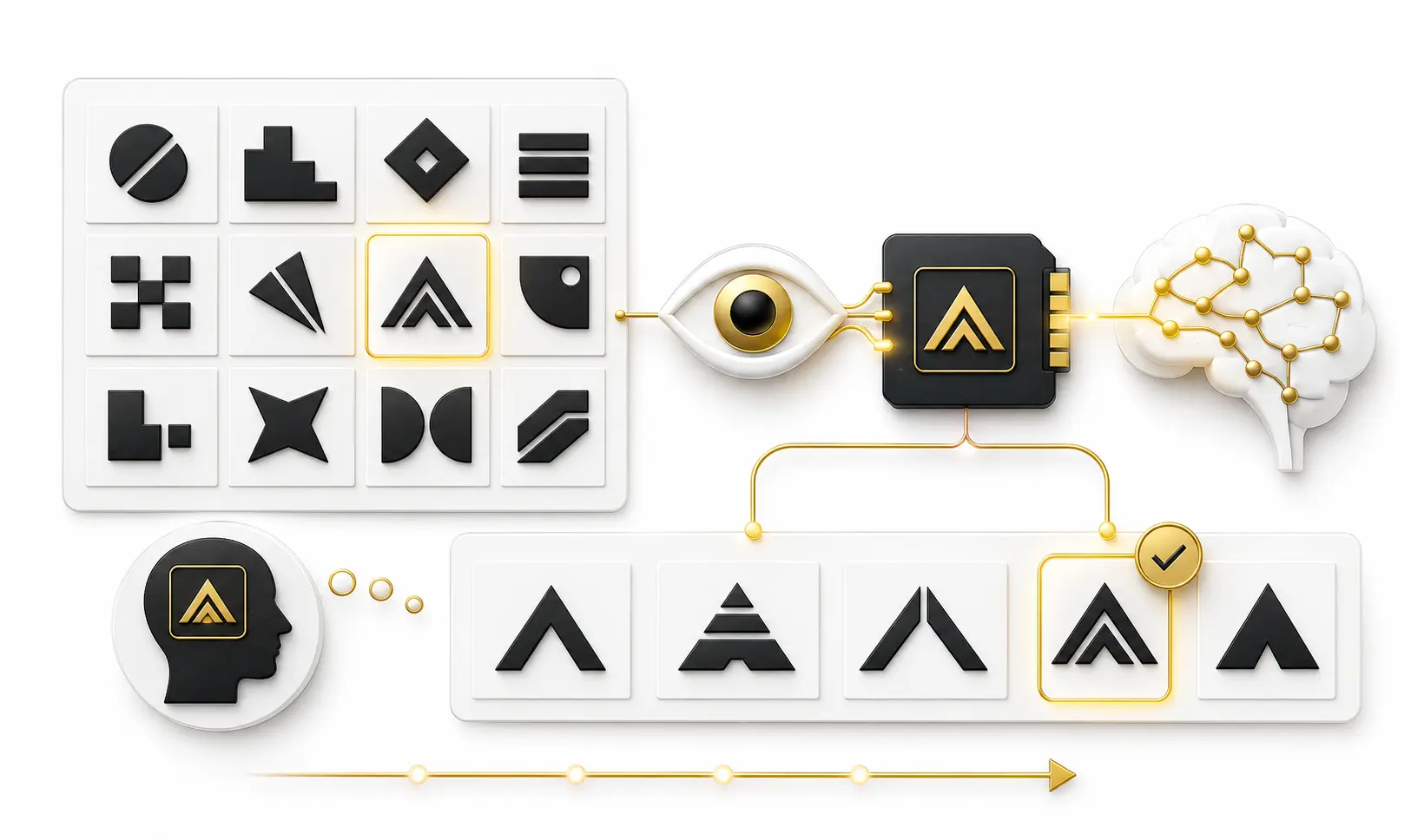
Asking a team which concept they prefer measures internal taste, not market memory. Psychological performance needs structured testing with the intended audience. Use the same exposure conditions for each concept, avoid revealing the design rationale before the test and separate immediate reaction from delayed retrieval.
1. First-Exposure Comprehension
Show the mark briefly in a realistic context, then ask what type of organization the viewer expects and what qualities the design suggests. Look for patterns across responses rather than treating one person's interpretation as a verdict.
2. Competitive Distinctiveness
Place the concept among relevant competitors. Ask participants which marks appear related, which one stands apart and whether any designs could be confused. A logo that looks unique in isolation may disappear inside its actual category.
3. Delayed Unaided Recall
After a delay and a different task, ask participants to describe or sketch what they remember without showing options. The goal is not artistic accuracy. Look for the feature that survives: a shape, letter, proportion or relationship.
4. Aided Recognition
Show the target with similar alternatives and ask which mark participants saw earlier. Record false recognition as carefully as correct answers. Confusion can reveal that the design relies too heavily on familiar category cues.
5. Attribution And Meaning
Ask which company or category the mark belongs to and why. A participant may remember the symbol but attach it to the wrong organization. Attribution testing checks whether memory benefits the correct brand.
- Test with people who resemble the intended audience.
- Use identical exposure time and context for every concept.
- Measure comprehension before explaining the strategy.
- Separate immediate liking from delayed recall.
- Include competitors and visually similar alternatives.
- Record the specific feature participants remember.
- Test monochrome and small-format recognition separately.
- Repeat the evaluation after refinement instead of relying on one session.
Do not ask only, "Which logo do you like?" Ask, "What did you understand, what did you confuse and what could you retrieve later?"
Common Psychology Mistakes In Logo Design
Treating Symbolism As Universal
Shapes and colors do not carry one permanent meaning across every market. Use them as hypotheses to test with the intended audience, not as automatic guarantees.
Optimizing Only For Immediate Liking
The concept people like during a presentation is not always the concept they remember or attribute correctly later. Preference, comprehension and memory are separate measures.
Confusing Simplicity With Sameness
Removing detail can improve fluency, but removing every distinctive feature leaves the brand with a generic category symbol. Simplification should strengthen the core cue, not erase it.
Explaining The Concept Before Testing It
Once participants hear the design story, they cannot provide a clean first interpretation. Test the unaided response first; explain the rationale only after the relevant answers are recorded.
Ignoring The Competitive Environment
A mark is rarely seen alone. Test it beside the logos, colors, app icons and packaging customers will encounter in the same decision environment.
Expecting Design To Replace Experience
A logo can support recognition and expectation, but it cannot compensate for an unclear offer or inconsistent service. Brand meaning is learned from what the company repeatedly does.
Psychology-Based Logo Evaluation Checklist
Use this checklist after strategic and technical reviews. It focuses on the way an audience may process, interpret and remember the mark rather than on personal style preferences.
- The primary visual cue can be identified quickly.
- The mark is clear without becoming interchangeable with competitors.
- The intended audience interprets the category and personality appropriately.
- Shape and typography support the same expectation.
- Color strengthens meaning but is not required for basic recognition.
- The design contains a feature the brand can use consistently.
- Participants remember the cue after a delay.
- Recognition belongs to the correct brand rather than a competitor.
- The mark remains meaningful across realistic touchpoints.
- The visual promise matches the experience the business can deliver.
Frequently Asked Questions
Logo design psychology examines how visual features, context and exposure influence attention, interpretation, recognition, emotion and memory. It helps designers test whether a mark creates the intended expectation and remains retrievable over time.
A memorable logo usually combines clear organization, an identifiable distinctive cue, relevant meaning and consistent exposure. Memorability depends on both the design and the experiences repeatedly associated with it.
Not automatically. Simplicity can improve processing, but an overly generic logo may be difficult to distinguish or attribute. The goal is clarity with a feature that remains specific to the brand.
Rounded and angular forms can activate different expectations, but their meaning depends on product category, typography, color, culture and context. Geometry should support the intended brand attribute and be tested with the target audience.
Repetition can increase familiarity and processing fluency, but it also reinforces confusion, inconsistency or negative experience. Exposure works best when the visual cue is stable and the customer experience supports the intended meaning.
No color creates trust universally. Meaning changes with shade, contrast, category conventions, culture and surrounding design. Trust is ultimately strengthened when visual expectations match real business behavior.
Use first-exposure comprehension, competitive comparison, delayed unaided recall, aided recognition and brand-attribution tests. Keep exposure conditions consistent and test with people who resemble the intended audience.
A logo can activate expectations, but deeper emotion is usually learned through products, communication and customer experience. Over time the mark becomes a retrieval cue for those accumulated associations.
No. Psychology provides useful questions and testing methods, not a universal design formula. Strategy, originality, accessibility, technical performance and legal distinctiveness must also shape the final decision.
Key Takeaways
Memorable logo design is a balance of cognitive ease, distinctive meaning and consistent real-world experience.
Make The Core Cue Clear
Help the visual system organize the mark quickly without stripping away everything that makes it ownable.
Balance Familiarity And Difference
Use enough category relevance to support understanding and enough distinctiveness to prevent confusion.
Test Memory, Not Just Taste
Measure comprehension, delayed recall, recognition and attribution instead of relying only on preference.
Build Meaning Through Experience
Consistent exposure makes a cue easier to retrieve; customer experience determines the association it carries.
Final Thoughts
The psychology of logo design is not a collection of shortcuts about circles, colors or fonts. It is a way of understanding how people notice a visual cue, organize it, interpret it and retrieve it later. The strongest identities make this process easier without becoming indistinguishable from everything else in the category.
Processing fluency supports clarity, distinctiveness creates a usable memory cue and repeated exposure builds familiarity. Shape, color and typography contribute expectations, but their effect always depends on context. The logo then gathers emotional meaning from the experiences delivered beneath it.
For designers and business owners, the most important change is methodological: replace assumption with testing. Evaluate what the audience understands before explanation, what it remembers after a delay and whether recognition belongs to the correct brand. Those answers are far more valuable than a room full of subjective opinions.
A memorable logo does not force people to study it. It gives them one clear, distinctive idea worth retrieving—and the business reinforces that idea every time it appears.