- Why Logos Matter
- Simplicity
- Memorability
- Versatility
- Scalability
- Relevance
- Timelessness
- Negative Space In Logo Design
- Logo Grid Systems
- Testing A Logo Before Launch
- Accessibility In Logo Design
- Building Brand Recognition
- Strategic Logo Systems
- Logo Approval Checklist
- Common Logo Design Mistakes
- Frequently Asked Questions
- Final Thoughts
Why Logos Matter
A logo is much more than a graphic symbol placed on a website or product. It is the visual signature of a business and one of the first things customers notice when they encounter a brand. Long before someone experiences a company's products or services, they often form an opinion based on its visual identity. That first impression may only last a few seconds, but it can influence whether a customer chooses to explore further or move on to a competitor.
The purpose of a logo extends far beyond decoration. It creates recognition, supports credibility and gives customers a simple visual reference they can remember. Every advertisement, business card, social media profile, mobile application, website and product package reinforces that same visual symbol. Over time, repeated exposure transforms a logo from a simple design into one of the company's most valuable business assets.
A Strong Logo Reduces Future Marketing Costs
Businesses with a clear and consistent visual identity spend less effort explaining who they are every time they launch a campaign. Once customers begin recognising the logo, every advertisement, social media post, product package and website visit reinforces existing familiarity instead of introducing the business from the beginning again.
Over months and years, that accumulated recognition becomes a competitive advantage. Marketing messages reach audiences faster because the visual identity has already established credibility and trust.
Customers Often Remember Shapes Before Names
Visual memory develops faster than verbal memory. People frequently recognise a familiar symbol, colour combination or icon before recalling the company name attached to it. That is one reason why strong visual identities continue generating value long after customers have forgotten a specific advertisement.
Many new businesses underestimate the importance of professional logo design because they view it as a creative exercise rather than a strategic investment. In reality, a logo works continuously behind the scenes. It strengthens marketing campaigns, improves recognition across multiple platforms and helps customers distinguish one business from another in crowded markets.
The world's most recognizable logos rarely became successful because they were visually complicated. They became successful because they consistently represented the same promise, personality and customer experience over many years. Every positive interaction with a business strengthens the meaning attached to its logo.
Simplicity
If one principle sits at the center of professional logo design, it is simplicity. A simple logo communicates faster, scales better and remains memorable long after a customer has seen it. Rather than overwhelming viewers with unnecessary details, successful logos reduce visual information to only what is essential.
Human attention is limited. Customers rarely spend several minutes studying a logo. Most interactions happen within seconds while scrolling through social media, browsing search results, walking past a storefront or viewing a product on a shelf. During these brief moments, complicated designs become difficult to process, while simple designs remain instantly recognizable.
Remove Before You Add
One of the most effective logo design techniques is to simplify before introducing new elements. If removing a shape, line or decorative effect does not reduce the logo's meaning, that element probably wasn't necessary in the first place. Strong logos communicate clearly with fewer visual decisions.
Simplicity should never be confused with a lack of creativity. Creating a simple logo is often significantly more challenging than creating a detailed one. Designers must carefully remove unnecessary elements while preserving the core idea that makes the brand distinctive. Every line, curve and shape should contribute to the message rather than compete with it.
Many of the world's most recognizable brands rely on surprisingly uncomplicated logos. They use clean geometry, balanced proportions and restrained visual language because simplicity performs consistently across websites, packaging, advertisements, business cards, merchandise and mobile devices. The fewer unnecessary details a logo contains, the easier it becomes to reproduce accurately and remember effortlessly.
Simple logos also adapt more effectively as technology evolves. Whether displayed on a smartwatch, smartphone, desktop monitor or large digital billboard, a clean design remains clear because it depends on strong structure instead of decorative detail.
Complexity Does Not Create Professionalism
Many businesses assume that adding gradients, shadows, intricate illustrations or multiple fonts will make a logo appear more premium. In reality, unnecessary complexity often reduces clarity, weakens recognition and creates difficulties when the logo is reproduced across different media.
Simplicity is not about removing creativity. It is about removing everything that distracts from the idea.
Memorability
A logo only becomes valuable when people remember it. Memorability transforms a visual mark into a long-term branding asset that customers can identify instantly, even after months or years without seeing it. Recognition develops gradually through repeated exposure, but it begins with a design that leaves a clear mental impression after only a brief encounter.
Professional designers often evaluate memorability by asking a simple question: can someone accurately describe the logo after seeing it for only a few seconds? If the answer is yes, the design is usually built around a strong visual concept rather than unnecessary complexity. Memorable logos rely on distinctive ideas, balanced proportions and meaningful visual relationships instead of excessive decoration.
It is important to understand that memorability does not require unusual graphics or complicated illustrations. In many cases, the strongest logos are memorable because they communicate one clear idea exceptionally well. Customers are far more likely to remember a simple visual concept than an intricate composition filled with competing details.
While memorable logos often appear effortless, their simplicity is rarely accidental. Designers intentionally remove unnecessary visual elements until a single dominant idea remains. This disciplined approach allows the mark to be recognised quickly, remembered accurately and recalled consistently across different situations.
Businesses sometimes confuse originality with complexity. Adding more shapes, colors or visual effects rarely improves recognition. Instead, it often reduces the brain's ability to recall the design accurately. A memorable logo achieves the opposite. It presents one focused visual message that becomes easier to remember every time customers encounter it.
Recognition is one of the greatest competitive advantages a business can build. Every memorable logo strengthens future marketing efforts because customers begin associating the visual identity with previous experiences, expectations and trust.
Memorable Logos vs Forgettable Logos
| Forgettable Logo | Memorable Logo |
|---|---|
| Tries to communicate many different ideas at once. | Focuses on one strong visual message. |
| Relies on decoration instead of meaning. | Uses every element with a clear purpose. |
| Looks similar to dozens of competitors. | Develops a distinctive and recognisable identity. |
| Difficult to recall after a short time. | Easy to recognise after only a few encounters. |
| Changes frequently to follow design trends. | Remains consistent while evolving carefully over time. |
Memorability is rarely the result of visual complexity. Instead, it comes from disciplined design decisions that remove distractions and strengthen recognition. Every successful logo prioritises clarity over decoration, allowing people to remember the brand long after the first interaction has ended.
Versatility
A professionally designed logo should perform consistently wherever customers encounter it. Modern brands no longer exist only on printed business cards or storefront signs. They appear on websites, mobile applications, social media platforms, product packaging, email signatures, advertising campaigns, presentation slides and even wearable devices. Every one of these touchpoints places different technical demands on the logo, making versatility one of the most important principles of professional logo design.
A versatile logo remains recognizable regardless of its size, color or application. It should look equally effective in full color, black and white, grayscale or a single solid color. Whether displayed on a bright background, a dark interface or an embossed product surface, the identity should remain clear without relying on special effects or decorative treatments.
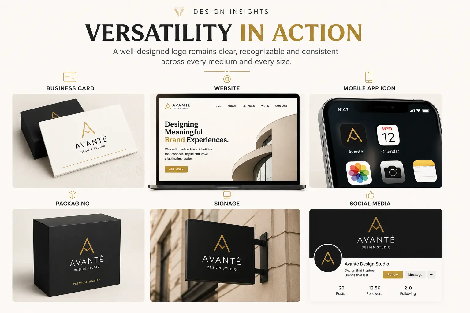
A practical way to evaluate versatility is to imagine the logo appearing in every place a customer might encounter the brand. If the design remains recognisable, balanced and readable regardless of size, material or background, it has achieved one of the most important objectives of professional logo design.
Professional designers evaluate versatility by applying a logo across dozens of real-world situations before presenting it to a client. A design that looks impressive inside design software may become unreadable when embroidered onto clothing, printed on promotional merchandise or displayed as a social media profile image. These practical tests often reveal weaknesses that are invisible during the concept stage.
Versatility also supports long-term brand consistency. Businesses should not require different logo designs for every marketing channel. Instead, they should develop a flexible identity system capable of adapting to different environments while preserving the same visual language. The stronger the consistency, the stronger the recognition customers develop over time.
Scalability
Scalability refers to a logo's ability to remain clear and recognizable at both extremely small and extremely large sizes. This principle has become increasingly important as brands operate across digital platforms that range from smartwatch screens to massive outdoor billboards. A successful logo must communicate effectively regardless of how much space is available.
One of the simplest ways to evaluate scalability is by reducing the logo to favicon size. If important details disappear, typography becomes unreadable or shapes merge together, the design may require simplification. Likewise, when enlarged for large-format printing, every curve, proportion and alignment should remain clean and balanced without appearing distorted or inconsistent.
Professional designers frequently test logos at multiple sizes throughout the design process rather than waiting until the final presentation. By identifying potential readability issues early, they can make small refinements before the identity is implemented across websites, packaging and marketing materials.
Scalability is closely connected to simplicity. Logos with excessive detail usually perform poorly when reduced because fine lines and intricate graphics disappear first. Cleaner structures maintain their visual impact regardless of scale, allowing customers to recognize the brand almost instantly.
In today's digital environment, scalability is no longer optional. Every brand competes for attention across hundreds of different screen sizes, making clear communication at every scale a fundamental requirement rather than a luxury.
A logo should never depend on size to communicate its identity. Strong ideas remain recognizable whether viewed at sixteen pixels or sixteen feet.
Relevance
An effective logo should feel appropriate for the audience it serves. Relevance ensures that the visual identity reflects the personality, values and positioning of the business rather than simply following current design trends. Customers often make subconscious judgments based on visual cues, which means every design decision contributes to the overall perception of the brand.
A technology startup, luxury fashion house, children's education platform and healthcare provider all require different visual approaches because they communicate with different audiences and operate within different expectations. While each logo should remain unique, it must also feel believable within its own market. A highly playful identity may confuse customers looking for professional legal services, while an overly formal logo could feel unapproachable for a family entertainment business.
Relevance begins with research rather than sketching. Designers first study the company's audience, competitors, values and long-term objectives before exploring visual solutions. This strategic foundation helps ensure that every design decision supports business goals instead of relying purely on personal preference.
It is equally important to avoid copying competitors. Relevance should never become imitation. The strongest identities understand industry expectations while introducing distinctive characteristics that help customers immediately recognize the brand among competing businesses.
A relevant logo communicates the right message to the right audience at the right time. It balances familiarity with originality, allowing customers to feel comfortable while still remembering what makes the brand unique.
Timelessness
A logo should be designed for years rather than seasons. While design trends change rapidly, successful brands depend on recognition that develops gradually over time. Constantly redesigning a logo to follow visual fashions weakens customer familiarity and reduces the value built through consistent exposure.
Timeless logos are created by focusing on enduring design principles rather than temporary stylistic trends. Clean geometry, balanced proportions, thoughtful typography and meaningful symbolism remain effective long after fashionable effects have disappeared. Instead of asking whether a logo looks modern today, designers should ask whether it will still communicate effectively five or ten years from now.
Many globally recognized brands have refined their logos over decades without abandoning the core visual concept. Small adjustments improve readability, simplify details or adapt to new technology, but the underlying identity remains consistent because it was built on strong strategic foundations from the beginning. Customers continue recognizing the brand even as minor refinements are introduced.
Timelessness does not mean refusing to evolve. Businesses grow, markets change and technology creates new opportunities. The goal is to evolve carefully without sacrificing the recognition that customers have already developed. Strategic refinement strengthens a brand, whereas unnecessary redesigns often create confusion.
When a logo is built on timeless principles instead of temporary trends, it becomes a long-term business investment capable of supporting recognition, trust and marketing performance for many years.
Negative Space In Logo Design
One of the most fascinating techniques in professional logo design is the use of negative space. While most people naturally focus on the visible shapes that form a logo, experienced designers often pay equal attention to the empty space surrounding those shapes. This unused area is not simply background. When used intentionally, it becomes an active part of the design that can communicate additional meaning without increasing visual complexity.
Negative space allows designers to hide secondary symbols, suggest movement or create visual relationships that customers discover naturally over time. Unlike decorative effects, these hidden elements rarely distract from the primary identity. Instead, they reward closer observation and often make the logo more memorable because the viewer experiences a small moment of discovery. That experience creates stronger recall than adding more visual detail ever could.
Perhaps the most famous example is the FedEx logo, where the space between the "E" and the "x" forms a subtle arrow. Most people do not notice it immediately, yet once discovered it becomes almost impossible to ignore. The hidden arrow reinforces ideas of movement, speed and delivery without introducing another graphic element. Similar techniques appear throughout professional branding because they communicate more while drawing less.
Negative space should always support the central idea of the logo rather than become a visual trick. If customers must struggle to understand the hidden message, the design risks becoming confusing instead of memorable. The strongest solutions remain clear at first glance while offering additional meaning to those who look more carefully.
Designers also need to remember that negative space behaves differently across sizes. A hidden symbol that works beautifully on a desktop monitor may disappear completely when reduced to a favicon or mobile application icon. For that reason, every negative-space concept should be tested across multiple sizes before becoming part of the final identity.
Great logo design is often defined not only by what is visible, but also by how intelligently the invisible space is used.
Logo Grid Systems
Many people believe successful logos are created entirely through artistic instinct. While creativity certainly plays an important role, professional logo designers frequently rely on carefully constructed grid systems to achieve balance, consistency and visual harmony. These grids are not designed to restrict creativity. Instead, they provide a framework that helps every element relate naturally to the others.
A grid system establishes consistent spacing, alignment and proportion throughout the design. Curves become smoother, circles align more naturally and visual weight is distributed evenly across the composition. Although customers rarely notice the underlying structure directly, they often sense the balance it creates. A logo built on thoughtful proportions simply feels more stable and professional.
It is important to understand that grids are tools rather than rules. Some of the world's most successful logos were refined using mathematical systems, while others evolved through repeated optical adjustments. Designers frequently combine both approaches, beginning with geometric structure before making small visual corrections that improve the overall appearance.
Beginners sometimes become overly dependent on complex golden ratio diagrams or intricate geometric overlays. While these systems can be useful learning tools, they should never replace clear communication. Customers do not choose a brand because its logo follows a mathematical formula. They remember it because the design communicates quickly, feels balanced and represents the business effectively.
Ultimately, a grid should support clarity rather than become the focus of the project. The strongest logos hide their construction process completely, allowing customers to experience only the finished identity rather than the technical framework behind it.
Testing A Logo Before Launch
Designing a logo is only part of the process. Before a visual identity is introduced to the public, professional designers spend considerable time evaluating how it performs in real-world situations. A logo may appear excellent inside design software while revealing serious weaknesses once applied to websites, packaging, signage or social media. Thorough testing helps identify these issues before they become expensive branding problems.
One of the simplest evaluations is the black-and-white test. If a logo depends entirely on color to communicate its identity, it may struggle in situations where full color reproduction is unavailable. A strong logo should remain recognizable even when reduced to a single solid color. This ensures flexibility across printing methods, merchandise and accessibility requirements.
Another valuable exercise is the small-size test. Designers reduce the logo to favicon dimensions or mobile application icon size to determine whether typography remains readable and essential shapes remain recognizable. Fine details that disappear at small sizes usually indicate unnecessary complexity. Simplifying those areas early improves usability across every digital platform.
Distance testing is equally important. Viewing the logo from several feet away or briefly glancing at it for only one or two seconds helps simulate real customer interactions. If the primary idea cannot be understood quickly, the design may require further refinement. Businesses should remember that most customers will never study their logo closely. Recognition must happen almost instantly.
Professional branding teams also place logos onto realistic mockups before approval. Packaging, websites, uniforms, signage, vehicles, invoices, presentation slides and social media graphics reveal practical challenges that flat design previews cannot. These applications demonstrate whether the identity remains consistent across every customer touchpoint.
Testing is not about proving that a logo is perfect. It is about discovering weaknesses while they are still easy and inexpensive to correct. Every successful branding project benefits from careful evaluation before public launch.
Accessibility In Logo Design
Great logo design is not only attractive—it is inclusive. Every customer should be able to recognize and understand a brand regardless of the device they use or any visual limitations they may have. As businesses communicate with increasingly diverse audiences across digital platforms, accessibility has become an essential part of professional logo design rather than an optional consideration.
One of the most common accessibility challenges involves color perception. Millions of people experience some form of color vision deficiency, making it difficult to distinguish certain color combinations. A logo that depends entirely on red and green, for example, may lose important meaning for part of its audience. This is one reason experienced designers ensure that a logo remains recognizable through shape, proportion and typography rather than relying exclusively on color.
Contrast also plays an important role. Logos placed on websites, presentations or printed materials should remain clearly visible against both light and dark backgrounds. Poor contrast reduces readability and weakens recognition, especially on mobile devices or under bright outdoor lighting conditions. Testing logos in different environments helps identify situations where visibility may become compromised.
Typography deserves equal attention. Decorative fonts may appear visually interesting, but they can become difficult to read at smaller sizes. Professional designers typically prioritize clarity over novelty, selecting typefaces that remain legible across websites, mobile applications, printed documents and product packaging.
Accessibility extends beyond technical compliance. It improves usability for everyone. A logo that remains readable, recognizable and flexible across different viewing conditions creates a better experience for every customer, strengthening both recognition and trust over time.
Building Brand Recognition
Designing a strong logo is only the beginning of building recognition. Recognition develops through consistent exposure over time. Every interaction a customer has with a business contributes to the mental association they form between the logo and the experience it represents. The more consistently a logo appears across different touchpoints, the stronger that association becomes.
Consistency does not mean placing a logo everywhere simply for visibility. Instead, it means presenting the same identity with the same proportions, colors, typography and visual standards across every platform. Websites, invoices, packaging, social media, advertisements, presentations and printed materials should all reinforce a unified visual experience. Inconsistency forces customers to repeatedly learn the identity, slowing the recognition process.
Recognition also depends on repetition. Customers rarely remember a brand after seeing its logo only once. Familiarity develops gradually through repeated exposure in meaningful contexts. Every successful interaction with the business adds another layer of trust to the visual identity, eventually allowing the logo to communicate reliability before a customer even reads the company name.
Businesses often assume that recognition is created through larger marketing budgets. In reality, many brands achieve stronger recognition simply by remaining visually consistent over longer periods. Customers remember what they encounter repeatedly, not necessarily what they encounter most expensively.
A professionally designed logo provides the foundation for recognition, but consistency transforms that foundation into long-term brand equity.
Recognition is not built by seeing a logo once. It is built by seeing the same logo consistently hundreds of times.
Strategic Logo Systems
Research
Understand the business, audience, competitors and market positioning.
Concept
Develop multiple ideas that communicate one clear visual direction.
Refinement
Simplify shapes, improve proportions and remove unnecessary details.
Validation
Test the logo across digital, print and real-world brand applications.
Every successful identity system follows a deliberate process rather than relying on inspiration alone. Research establishes direction, conceptual thinking generates possibilities, refinement improves clarity and testing confirms that the final logo performs consistently across every intended application.
Modern brands rarely rely on a single logo variation. Instead, they develop complete logo systems capable of adapting to different platforms without sacrificing recognition. This approach acknowledges that today's businesses communicate across websites, social media, mobile applications, packaging, digital advertising, merchandise and physical environments, each with unique technical requirements.
A strategic logo system typically includes several carefully designed variations. The primary logo serves as the main identity, while secondary versions support situations where available space is limited. Horizontal layouts, stacked layouts, icon-only versions, monochrome variations and simplified responsive marks all allow the brand to remain recognizable regardless of the medium.
These variations should never appear unrelated. Every version belongs to the same visual family, sharing typography, proportions and overall personality. Customers should immediately recognize the brand whether they see the complete logo on a website header or a simplified icon inside a mobile application.
Strategic logo systems also simplify future growth. As businesses expand into new platforms and technologies, adaptable branding reduces the need for repeated redesigns. Instead of creating new identities for every situation, designers extend the existing system while preserving consistency.
Successful brands do not create multiple logos. They create one flexible identity capable of working everywhere customers encounter it.
Logo Approval Checklist
Before approving a logo for public use, professional designers perform one final evaluation to ensure the identity is ready for real-world applications. This process goes beyond aesthetics and focuses on practical performance. A logo may look impressive during presentation, but successful branding depends on how well it functions after launch.
- Communicates the intended brand personality.
- Remains recognizable in black and white.
- Scales clearly from favicon size to large signage.
- Typography remains readable across different sizes.
- Works on both light and dark backgrounds.
- Includes responsive logo variations where necessary.
- Maintains consistent spacing and proportions.
- Performs well across print and digital media.
- Has been reviewed for potential trademark conflicts.
- Final vector files and brand assets are prepared for delivery.
Completing this checklist does not guarantee that a logo will become famous, but it greatly increases the likelihood that the identity will perform reliably across every stage of a company's growth.
Common Logo Design Mistakes
Even talented designers can create ineffective logos when they focus too heavily on appearance while overlooking strategy. Businesses often judge a logo by asking whether it looks attractive, yet professional designers evaluate whether it communicates effectively, performs consistently and supports long-term brand recognition. Understanding the most common mistakes helps businesses make better decisions before investing in a new identity.
One of the biggest mistakes is trying to communicate too many ideas at once. Some logos include multiple symbols, decorative graphics, complex typography and elaborate color schemes in an attempt to tell the entire story of the business. The result is usually the opposite of what was intended. Instead of creating clarity, excessive detail makes the logo harder to recognize and even more difficult to remember.
Another common problem is following short-term design trends. Every year introduces new visual styles that quickly become popular across social media and design communities. While trends can provide inspiration, building an entire brand identity around temporary fashion often leads to premature redesigns. A logo should remain effective for many years rather than only during the current design cycle.
Poor typography is another frequent issue. Selecting fashionable fonts without considering readability often creates problems when logos are displayed on smaller screens or printed at reduced sizes. Typography should strengthen communication rather than compete for attention.
Businesses also make the mistake of relying too heavily on color. A logo that only works in full color becomes difficult to reproduce across many applications. Every professional identity should remain recognizable in black and white because many practical situations require simplified reproduction.
Ignoring scalability creates equally serious challenges. Fine details, thin lines and complex illustrations may appear attractive on a large monitor but disappear entirely when reduced to a mobile application icon or favicon. Professional logo design always considers how the identity performs across both large and small formats.
Finally, many organizations neglect trademark research until after the logo has already been launched. Legal disputes, customer confusion and expensive rebranding projects often begin with assumptions rather than proper investigation. Conducting research before implementation is significantly less expensive than resolving conflicts afterward.
The strongest logos are rarely the most complicated. They are the ones that communicate clearly, adapt effortlessly and remain memorable for years.
Frequently Asked Questions
An effective logo combines simplicity, memorability, versatility, scalability, relevance and timelessness. Rather than relying on decorative effects, it communicates one clear idea that customers can quickly recognize and remember across every platform.
Simple logos are easier for the human brain to process and remember. They also reproduce more accurately across websites, mobile devices, printed materials and promotional products without losing clarity.
Most professional logos use one to three primary colors. Limiting the color palette improves recognition, simplifies reproduction and strengthens visual consistency across different media.
Yes. Simplicity should improve communication, not remove personality. If every distinctive characteristic is eliminated, the logo may become generic and difficult to distinguish from competitors.
Many real-world applications such as invoices, embossing, engraving, newspaper printing and certain merchandise require monochrome reproduction. A professional logo should remain recognizable without depending on color.
There is no fixed timeline. Most successful brands refine their identities only when business strategy, customer expectations or technology genuinely require change. Frequent redesigns often weaken recognition.
A logo is one element of a broader brand identity. Brand identity also includes typography, colors, imagery, iconography, layouts and other visual assets that work together to create a consistent customer experience.
Yes. A professionally designed logo creates a stronger first impression, supports long-term recognition and reduces the likelihood of expensive redesigns as the business grows.
AI tools can accelerate idea generation, but successful branding still depends on strategy, research and human decision-making. The strongest identities combine technology with thoughtful design expertise.
Simple logos are easier to recognize, remember and reproduce consistently across thousands of applications. Their success comes from strategic thinking rather than visual complexity.
A logo is ready when it communicates clearly, performs across different sizes and formats, supports the brand strategy and successfully passes practical testing in real-world applications.
Absolutely. Trends come and go, but originality helps businesses build long-term recognition. A distinctive identity remains valuable long after temporary visual styles have disappeared.
Key Takeaways
Every memorable logo follows a small number of timeless principles. Before moving on, review the most important lessons from this guide.
Prioritise Simplicity
Remove unnecessary visual elements until the core idea becomes immediately understandable.
Design for Recognition
A memorable logo should be recognised quickly and remembered long after the first impression.
Think Beyond One Medium
Every logo must remain effective across print, digital products, packaging and signage.
Build for the Long Term
Timeless design decisions create stronger brands than short-lived visual trends.
Final Thoughts
Professional logo design is not about creating attractive artwork. It is about building a visual identity capable of representing a business consistently for years. Every principle discussed throughout this guide—simplicity, memorability, versatility, scalability, relevance, timelessness and strategic thinking—contributes to one larger objective: helping customers recognize and trust a brand more easily.
The most successful logos are rarely created through inspiration alone. They emerge from research, careful planning, thoughtful refinement and extensive testing across real-world applications. Designers balance creativity with practicality, ensuring that every decision strengthens communication rather than adding unnecessary complexity.
As technology continues to evolve, the environments in which logos appear will also continue changing. Mobile devices, wearable technology, digital interfaces and emerging platforms will introduce new technical requirements, yet the fundamental principles of effective logo design will remain remarkably consistent. Brands that invest in strong foundations today will adapt far more easily tomorrow.
If there is one lesson to remember, it is this: a logo is far more than a graphic. It is one of the most valuable business assets a company will ever create. Designing it with care, strategy and long-term thinking is an investment that continues paying dividends every time a customer recognizes and remembers the brand.