- What Is Font Pairing?
- Do You Need More Than One Font?
- Assign Roles Before Choosing Fonts
- Choose An Anchor Font
- Contrast Without Conflict
- Structural Features That Connect Fonts
- Reliable Font-Pairing Strategies
- One Family, Superfamilies And Variable Fonts
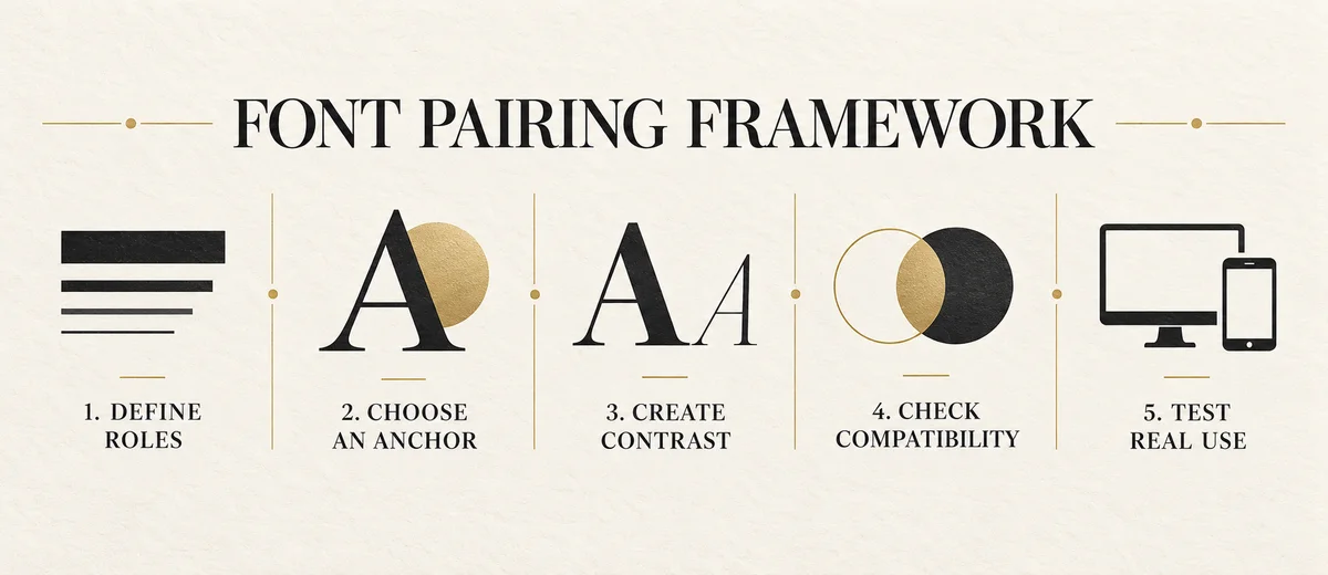
- How To Pair Fonts Step By Step
- Match The Brand And Content
- Practical Pairing Examples
- Logo Fonts Vs Reading Fonts
- Accessibility And Language Support
- Performance And Licensing
- Test The Pair In Real Use
- Common Font-Pairing Mistakes
- Font-Pairing Decision Matrix
- Approval Checklist
- Frequently Asked Questions
- Final Thoughts
What Is Font Pairing?
Font pairing is the deliberate use of two or more typefaces inside one communication system. One typeface might carry headlines and high-emotion moments, while another handles paragraphs, labels, forms and instructions. The pair succeeds when readers understand the hierarchy quickly, the fonts feel related to the same brand and neither typeface makes the other harder to use.
That definition is more useful than “two fonts that look good together.” Appearance matters, but it is only one part of the decision. A beautiful display face can fail if it lacks the symbols a price list needs. A highly readable interface font can feel wrong if it makes a luxury brand sound generic. A fashionable combination can collapse when the website loads slowly, the fallback font changes every line break or the social team cannot reproduce the hierarchy.
Good pairing therefore connects four questions: What job must each font perform? What relationship should readers see between those jobs? Does the combination express the intended brand character? Can the organization use it consistently in the real world? This broader view turns font pairing from a taste exercise into a practical design decision.
Do You Need More Than One Font?
Not every brand needs a pair. A well-built typeface family may include light, regular, medium, bold, italic, condensed and display styles. Size, weight, width, case and spacing can create a complete hierarchy without introducing another visual voice. This is often the strongest option for a small team because it is easier to license, load, document and use consistently.
Add a second typeface only when it solves a real problem. Perhaps the primary family is expressive in short headings but tiring in long reading. Perhaps the body face is excellent for digital products but cannot create the editorial distinction needed for campaigns. Perhaps the brand needs a clear shift between human storytelling and technical data. The second font should contribute a capability, not simply variety.
A useful test is to remove the proposed secondary font from three sample layouts. If the hierarchy, tone and function remain equally strong, the extra family may not be necessary. If the layouts become flat, the brand loses an important voice or a practical task becomes harder, the pairing has a defensible role.
Every Font Creates Operational Cost
A new family affects licenses, brand templates, website files, design QA, vendor handoff and employee training. Simplicity is not a lack of creativity; it is often what makes a typography system sustainable.
This decision also belongs inside the wider typography system for the brand. A font pair is not an isolated graphic-design trick. It must cooperate with hierarchy, spacing, voice, accessibility and the content customers actually read.
Assign Roles Before Choosing Fonts
Pairing becomes easier when the content roles are visible. List the recurring text your brand produces: campaign headlines, page titles, long paragraphs, navigation, buttons, product data, captions, legal text, quotations, numbers and multilingual content. Group those items by function rather than by current appearance.
Most systems need a display role and a reading role. The display role can carry more personality because it appears at larger sizes and in shorter phrases. The reading role needs stable rhythm, distinct letterforms, sufficient weights and comfortable spacing across longer passages. A digital product may add a compact interface role; a research or financial product may need a numerical or monospaced role.
Give each role a boundary. “Use Font A for all headlines above 28 pixels” is clearer than “use Font A when it looks better.” “Use Font B for paragraphs, UI labels and small captions” prevents designers from improvising a different solution on every screen. Rules can allow judgment, but the default must be obvious.
A Simple Two-Font Role System
| Role | Primary need | Typical type choice | Boundary |
|---|---|---|---|
| Display | Recognition and emphasis | Distinctive serif, sans or display family | Short headlines, key numbers and campaign statements |
| Reading | Clarity and endurance | Text-focused serif or sans-serif family | Paragraphs, navigation, forms, captions and instructions |
| Accent | Occasional tonal shift | Italic or alternate style from either family | Quotes or labels, never a default third voice |
Choose An Anchor Font
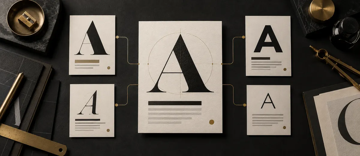
An anchor font is the first committed choice. It gives the search a fixed point: every candidate for the second role can be judged in relationship to something real. The anchor does not have to be the most expressive typeface. It should be the font with the strongest non-negotiable reason to exist.
For a content-heavy website, the body font may be the anchor because reading quality, language coverage and web performance are critical. For a fashion label, an established wordmark or display style may set the emotional direction. For a software product, an interface family with excellent numerals and compact spacing may be the most important constraint.
Test the anchor alone before searching for a partner. Set a long paragraph, a short headline, a price, a date, a button and a difficult brand name. Review common punctuation, currency symbols and the letters that appear repeatedly in the business. If the anchor cannot perform its primary job, a second font will not rescue it.
Use Real Words Before Alphabet Specimens
Type specimens are useful for comparison, but approve an anchor with customer-facing language. A font can look elegant in “Hamburgefonts” and still fail on your product names, prices or calls to action.
Create Contrast Without Creating Conflict
Contrast tells readers that two text elements have different importance or purpose. Conflict makes the elements feel unrelated or competitive. The difference is not the amount of visual change alone; it is whether the change creates a clear relationship.
A high-contrast serif headline and a neutral sans-serif paragraph may differ in classification, stroke modulation and historical voice. They can still work together if their scale, rhythm or proportions create a bridge. Conversely, two geometric sans-serif fonts can conflict when they are almost identical but differ in small, distracting ways. The reader sees neither useful contrast nor true consistency—only an unexplained substitution.
Decide which attribute will create contrast. Classification is the familiar option: serif with sans serif. Width can be equally effective: condensed display type against a more open reading face. Weight, scale, case and texture can provide contrast even within one family. Choose one or two dominant differences and let other features supply compatibility.
Avoid maximum contrast on every axis. A delicate high-contrast serif in italics, paired with a heavy geometric condensed sans in uppercase, may differ in classification, weight, width, posture and texture at once. That can be appropriate for a deliberately eclectic campaign, but it is difficult to govern as a long-term system. Most brands need a quieter relationship.
A useful pair is different enough to establish roles and related enough to sound like one brand.
Structural Features That Connect Two Fonts
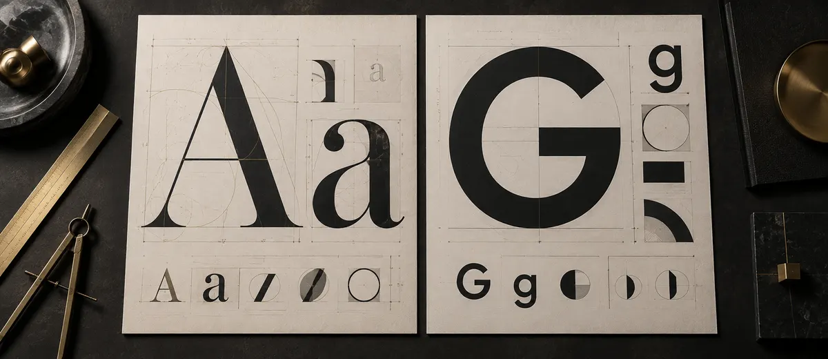
When a pair feels harmonious, the connection often lives below style labels. Examine the lowercase letters, because they dominate normal reading. Compare x-height, the apparent height of forms such as x, a and e; compare the width of letters; look at whether counters feel open or compact; and notice whether curves are round, oval or slightly squared.
Stroke character matters too. One face may have nearly uniform strokes while another moves dramatically between thick and thin. Terminals may end sharply, softly or with an angled cut. The lowercase a and g may be single-storey or double-storey. Dots may be circular or square. These details do not need to match, but the pair should share enough rhythm that moving from headline to paragraph feels intentional.
X-height is especially easy to misread. Two fonts set at 16 pixels can look substantially different in size because one has tall lowercase letters. Do not force identical numerical settings. Adjust the fonts optically, then check whether the resulting hierarchy works at several viewport sizes. The goal is perceived balance, not equal values in a design panel.
The Google Fonts guidance on pairing typefaces similarly treats pairing as a balance of shared construction and useful contrast. That principle is more durable than memorizing a list of fashionable combinations because it can be applied to any library.
- Compare lowercase x-height and capital height at optical sizes.
- Look for compatible curves, counters and overall letter width.
- Check whether stroke weight creates balance rather than accidental imbalance.
- Compare the forms of a, g, e, R, G, 1, 0 and punctuation.
- Set the pair in real words, not only an alphabet.
- Review a full paragraph to compare rhythm and texture.
Reliable Font-Pairing Strategies
Classification is a starting point, not a guarantee. “Serif plus sans serif” describes thousands of possible relationships, from calm editorial systems to combinations that have nothing in common. Use the strategy to create a shortlist, then evaluate construction, function and brand fit.
Serif Display With Sans-Serif Text
This familiar pairing creates an immediate division between expressive headlines and practical reading. It often works for editorial, hospitality, cultural and premium brands. Choose a serif that remains confident at the headline sizes you actually use, then support it with a sans-serif that has a compatible x-height or curve language. Avoid a body face so clinical that it removes all warmth from the display voice.
Sans-Serif Display With Serif Text
A strong sans-serif headline can give structure and modernity while a text serif provides a comfortable long-form rhythm. This can suit publishing, education, professional services and products that need both clarity and depth. Test small serif text on the lowest-quality screens in scope; fine details that look refined in print may become fragile digitally.
Two Sans-Serif Typefaces
Use a clear difference in width, construction or voice. A condensed headline face can pair with an open humanist sans for reading. A geometric display face can work with a quieter grotesk or humanist family if their proportions connect. If both are neutral, medium-width sans serifs performing similar jobs, the pairing may add complexity without adding hierarchy.
Two Serif Typefaces
This requires more control because serif details carry strong historical and visual character. Pair a display serif with obvious contrast or distinctive proportions against a text serif designed for paragraphs. Keep the roles far apart in scale and usage. Two old-style text serifs at neighboring sizes will often look like an error.
Decorative Display With A Neutral Workhorse
Let the expressive font occupy a narrow, high-value role and give everything else to a restrained family. The more personality the display typeface carries, the less the partner should compete. This rule protects readability and preserves the accent's impact. It is especially important for scripts, hand-drawn faces and experimental display designs.
Contrast Within One Family
Use weight, optical size, width, italics and capitalization to create hierarchy while keeping construction constant. This is not a compromise; it can produce a more recognizable system than two unrelated fonts. A variable family may provide a wide design range within one file and one visual language.
Choose The Strategy By Need
| Need | Useful starting strategy | Main risk |
|---|---|---|
| Editorial distinction | Serif display + sans text, or the reverse | Relying on classification without structural compatibility |
| Digital product clarity | One broad family or two clearly separated sans serifs | Loading extra fonts that do the same job |
| Luxury expression | Controlled display serif + neutral reading face | Thin strokes and low contrast failing at small sizes |
| Energetic campaigns | Condensed or expressive display + calm workhorse | Letting the accent spread into paragraphs and UI |
| Maximum consistency | One family, superfamily or variable family | Hierarchy becoming too subtle |
One Family, Superfamilies And Variable Fonts
A font family contains related styles such as regular, italic and bold. A superfamily extends the idea across coordinated classifications or widths—for example, serif and sans-serif relatives designed to work together. These systems reduce guesswork because the underlying proportions and design logic are intentionally connected.
Variable fonts package a range of styles into adjustable axes. Common axes include weight, width, slant and optical size, although individual families may offer others. They can create substantial hierarchy without adding a second typeface, and a single variable file may replace several static files when implemented carefully.
Do not assume a variable font is automatically faster or more flexible for every project. File size depends on the family, axes and character coverage. Team tools may expose variable controls differently. Test the actual build, confirm browser and application support for the features you plan to use and document approved axis values so the system does not become infinitely inconsistent.
How To Pair Fonts Step By Step
Step 1: Define The Content Roles
List the actual text categories across your most important touchpoints. Separate display, reading, interface, data and accent needs. Note minimum sizes, languages, print conditions and any technical restrictions. This prevents an attractive headline specimen from controlling a system that mostly serves product descriptions or forms.
Step 2: Choose The Anchor
Select the family that best solves the most important constraint. Record why it is the anchor: established wordmark relationship, excellent long-form reading, complete language set, numerical clarity or another concrete reason. A documented reason makes later decisions easier to defend.
Step 3: Decide What Must Contrast
Choose the dominant difference the second font should create. It may need more editorial warmth, compact width, stronger display impact or a calmer reading texture. Do not browse until the missing function is clear. A search framed as “a warmer headline face with similar lowercase scale” is more productive than “a cool font.”
Step 4: Identify Features That Should Connect
Compare x-height, width, curves, stroke character and overall rhythm. Select two or three shared qualities. The fonts do not need to resemble each other everywhere; the common features simply give the contrast a visible reason to belong.
Step 5: Build A Small Shortlist
Limit the first review to three or four candidates. Large font boards encourage preference voting and make differences difficult to remember. Set every candidate with the same real content and roles so the comparison is fair.
Step 6: Create A Working Hierarchy
Assign sizes, weights, line heights and spacing. Do not judge bare font names. A pair may seem weak until the hierarchy creates enough contrast, or impressive until both fonts are forced into the same scale. Test at least a page title, section heading, paragraph, caption, button and number.
Step 7: Stress-Test Real Content
Use the longest product name, a dense paragraph, a two-line mobile heading, currency, dates, punctuation and difficult letter combinations. Include translations and diacritics when relevant. A system should survive the awkward content the business already has, not only the clean copy in a presentation.
Step 8: Check Practical Rights And Files
Confirm licenses, formats, weights, webfont availability and distribution rules before stakeholder approval. Replacing a font after templates and code are built wastes far more time than checking the license during the shortlist.
Step 9: Compare In Context And Choose
Place the strongest two candidates into realistic brand applications. Review hierarchy, tone, recognition, readability, accessibility and implementation cost. Choose the pair that solves the whole system most reliably—not the one with the most dramatic single mockup.
Step 10: Document The Rules
Record each role, approved weights, fallback stacks, size ranges, spacing guidance, exceptions and examples of misuse. Add font files or access instructions and licensing records to the brand handoff. A pairing becomes a system only when another person can use it correctly.
Present Systems, Not Font Menus
Show decision-makers two or three complete mini-systems with identical content. A font name on a white slide invites taste; a working hierarchy invites a conversation about the brand and reader.
Match The Pairing To Brand Personality And Content
Typeface personality is contextual. A high-contrast serif may feel luxurious in spacious packaging, authoritative in an editorial masthead or fragile in a small mobile interface. A geometric sans can feel modern, friendly or impersonal depending on width, weight, spacing and surrounding color. Avoid reducing categories to fixed emotional labels.
Begin with the brand's positioning and communication behavior. Is the brand calm or energetic, expert or conversational, restrained or expressive? Then define what those qualities mean in typography. “Approachable” might require open forms, generous spacing and soft curves. “Precise” might require controlled proportions, clear numerals and disciplined alignment. Concrete attributes produce better choices than mood words alone.
Content changes the answer. A museum, accounting platform and children's publisher may all want to feel trustworthy, but they ask readers to do different things. The museum needs interpretive reading and cultural presence. The platform needs rapid scanning, data clarity and form completion. The publisher needs warmth, character and age-appropriate legibility. A good pair supports the task as well as the tone.
Typography also participates in the broader visual identity system. Compare the pair with logo geometry, illustration style, layout density and photography. Shared visual logic matters more than forcing every element to match literally.
Practical Font-Pairing Examples By Brand Scenario
Ready-made font lists can start exploration, but copying a named pair does not prove it belongs to your brand. The following scenarios describe relationships rather than prescriptions. Use them to build a shortlist from the font libraries and licenses available to your project.
Scenario-Based Pairing Directions
| Brand scenario | Useful pairing direction | What to test |
|---|---|---|
| Professional services | Measured serif display + clear humanist sans text | Authority without distance; long reports; tables and legal copy |
| Technology product | One versatile sans family, or geometric display + practical UI sans | Navigation, forms, numbers, small screens and performance |
| Food or hospitality | Warm display serif or restrained script + neutral reading face | Menus, prices, signage, booking flows and language coverage |
| Luxury retail | Distinctive display face + quiet text family with strong small sizes | Fine strokes, packaging print, mobile commerce and sale messaging |
| Education or publishing | Strong sans headings + text serif, or coordinated superfamily | Long reading, hierarchy depth, captions and accessible spacing |
| Youth or creative brand | Expressive display + stable sans-serif workhorse | Energy without visual fatigue; social templates and fast-moving campaigns |
For a professional-services brand, do not equate seriousness with stiffness. A serif with moderate contrast and open forms can bring authority, while a humanist sans keeps digital explanations approachable. A technology company may not need two sans-serif families if one variable family covers display and interface needs; the stronger choice may be one font used more deliberately.
Luxury brands should test more than large campaign headlines. Hairline details can disappear on uncoated packaging, lower-quality displays or small product cards. Hospitality brands should include prices, dietary symbols and multilingual menus. Education brands should test sustained reading, not only covers. The best example is always the one that survives the work.
If you are choosing a pairing around an existing logo, consider how type contributes to the psychological impression of the logo. Look for complementary energy rather than a duplicate of the mark. The supporting typography should extend the brand's voice without making every message resemble the logo.
Pairing A Logo Font With Body And Interface Fonts
A logo and a reading system solve different problems. A wordmark appears in a short, controlled arrangement and may use customized letters, adjusted spacing or outlined artwork. Body copy must handle unpredictable sentences, repeated exposure, multiple sizes and many technical environments. Using the logo font everywhere can turn a distinctive asset into a tiring voice.
Start by identifying the logo's dominant features: geometric or organic shapes, sharp or soft terminals, narrow or wide proportions, formal or informal rhythm. Choose a reading family that echoes one feature while remaining calmer. A sharply cut wordmark might connect to a sans-serif with similarly decisive terminals, but the body face can have more open counters and easier spacing.
Keep the relationship visible without imitation. If the logo is already expressive, the supporting font should create breathing room. If the logo is minimal, typography may carry more personality through headlines. These decisions should support the core principles of a functional logo: clarity, distinctiveness, appropriate character and reliable performance across applications.
Accessibility, Readability And Language Support
Pairing is not accessible merely because the body font is called readable. Accessibility depends on the whole presentation: size, weight, line length, spacing, contrast, zoom behavior and the clarity of individual characters. Thin type on a low-contrast background remains difficult regardless of the font's reputation.
The W3C guidance for text spacing expects content to remain functional when users increase line height, paragraph spacing, letter spacing and word spacing. Its guidance also requires normal text to meet a minimum contrast ratio of 4.5:1 in the relevant WCAG success criterion, with a lower threshold for qualifying large text. Test the actual design rather than assuming a heavier font or darker color is sufficient.
Check ambiguous characters that matter to the content: uppercase I, lowercase l, the number 1, zero and uppercase O. Review apertures in c, e and s, and make sure bold weights do not close counters. For long reading, line length and line height can matter as much as the typeface. A practical starting range is roughly 45 to 75 characters per line, adjusted for audience, device and language.
Language support must be tested before approval. Confirm accented characters, punctuation, currencies, fractions, symbols and every script the brand uses. If the primary display font lacks a script, choose a companion designed for that language and match apparent scale, weight and rhythm. Do not let the interface silently fall back to an unrelated system font.
Test the pair with the audience's real reading conditions as well. A combination that feels refined on a large studio monitor may become tiring on a budget phone, in bright daylight or inside a dense form. Increase text size without changing the viewport, use browser zoom and inspect the page with custom spacing. Then ask readers to complete a task rather than simply rate the design. Successful typography supports comprehension and action; it does not depend on everyone sharing the designer's eyesight, device or familiarity with the content.
Test At 200% Zoom And With User Spacing
A pairing is not ready if enlarged or re-spaced text overlaps, disappears or loses functionality. Include zoom, narrow screens and user-adjusted spacing in the prototype review, not only the final audit.
Web Performance, Fallbacks And Font Licensing
Every downloaded font file competes for time and bandwidth. Two families with several weights, italics and broad character sets can become a significant payload. Load only the styles the system actually uses. Prefer modern webfont formats, subset responsibly when the license and language plan allow it, and avoid shipping a weight merely because it exists.
Define a font-display strategy instead of accepting an accidental period of invisible text. The font-display options documented by MDN control how the browser handles the block and swap periods. The correct choice depends on how critical the face is and how disruptive a late swap would be.
Fallback metrics deserve attention. A fallback with very different width or x-height can change line breaks and move content when the webfont arrives. Use a sensible stack, compare it on slow connections and consider CSS font metric overrides when the implementation requires closer matching. Preload only the truly critical files; indiscriminate preloading can steal bandwidth from more important resources.
Licensing is separate from price. “Free download” does not automatically authorize logo, commercial print, web embedding, app distribution, editable templates or client transfer. Read the license, save a copy with the project and record where the font came from. Check whether contractors and partner agencies need their own licenses. A pairing that cannot be deployed legally is not a viable pairing.
Approving The Mockup Before Checking Rights
Do the license and file audit while candidates are still replaceable. Discovering an app-embedding restriction after development begins can force a costly redesign.
Test The Pair Across Real Brand Touchpoints
A pairing should be reviewed as a system, not as one polished poster. Build a compact stress-test board using the brand's priority applications. Include a desktop landing page, a narrow mobile screen, a social graphic, a document or presentation, and one production condition that is genuinely difficult—small packaging, outdoor signage, a dense data table or a low-resolution display.
Use real content at realistic lengths. Replace “Lorem ipsum” with the longest headline, shortest button, awkward product name, negative number, date and paragraph the organization could publish. Check whether the display font wraps too early, whether emphasis survives in the body family and whether the hierarchy remains obvious without color.
Review at actual size. A layout zoomed to fit a large monitor hides problems that appear on a phone or printed card. Print physical samples when print matters. Test dark mode when the product offers it. Reduce contrast and simulate slower loading. Turn off the primary font and inspect the fallback. Good testing makes hidden assumptions visible before they become brand inconsistency.
Invite feedback with criteria. Ask: Which element do you read first? Does the body remain comfortable? Does the pair fit the intended personality? Can you distinguish heading levels? Does either font create a technical or licensing risk? Avoid “Which one do you like?” because preference alone does not reveal whether the system works.
Run one comparison without showing the font names or explaining which option the designer prefers. Present the same content, layout, color and spacing for every candidate so reviewers respond to the typographic system rather than a fashionable label. Record the result against the original requirements, including audience, tone, reading conditions, languages, file weight and permitted uses. If two options perform equally well, choose the simpler system to maintain. Then repeat the winning test with someone who was not involved in selection. Fresh readers often notice cramped paragraphs, weak numerals or confusing hierarchy that a project team has learned to ignore. This final check turns approval into evidence instead of consensus by fatigue.
Compare no more than three or four viable candidates against the anchor.
Assign roles, sizes, weights, spacing and realistic content.
Review mobile, desktop, print, language, fallback and difficult content.
Approve one system and record rules, assets, licenses and exceptions.
Common Font-Pairing Mistakes
Choosing Two Fonts That Are Too Similar
If the fonts share the same classification, width, weight and general construction, the difference may look accidental. Use one family or create a clearer contrast. Tiny differences in terminals or x-height attract attention without helping hierarchy.
Choosing Two Fonts With Nothing In Common
Maximum contrast can make the system feel assembled from separate brands. Look for at least one structural or tonal bridge: compatible lowercase scale, related curves, similar rhythm or a shared degree of formality.
Giving Both Fonts The Same Job
When either font can appear anywhere, inconsistency is inevitable. Assign a primary role and explicit boundary to each family. Exceptions should be rare and documented.
Using Too Many Typefaces
A third or fourth font often compensates for a weak hierarchy. First use size, weight, spacing, color and layout more deliberately. Multiple fonts are not a substitute for information structure.
Pairing Personalities Instead Of Performance
A combination may look “friendly and modern” in a mood board while failing in long copy, prices or small screens. Emotional fit matters, but practical evidence must confirm it.
Forcing Equal Numerical Sizes
Different x-heights and proportions make equal point sizes look unequal. Adjust optically and compare real text blocks. Balance is visible, not mathematical.
Ignoring The Existing Logo And Identity
Fonts do not need to copy the logo, but they should not introduce an unrelated voice. Review the entire identity and avoid the branding mistakes that create inconsistency between touchpoints.
Testing Only Large Headlines
Display samples hide punctuation, paragraph rhythm, fallback behavior and language gaps. Approve the pair with the smallest and densest text it must handle.
Ignoring Color And Background Conditions
Thin strokes, small sizes and textured imagery change readability. Test typography with the real palette and contrast conditions, using the same discipline applied when choosing accessible brand colors.
Copying A Popular Pair Without A Reason
Popular combinations can be useful references, but they may be overused, poorly licensed for the project or wrong for the content. Explain the role, connection and proof behind your choice.
A Font-Pairing Decision Matrix
Score finalists against the same criteria instead of letting one dramatic mockup dominate the decision. Use a five-point scale and add notes. Weight the categories according to the project: a reading platform may prioritize readability and language support, while a campaign-led brand may give more weight to distinctive expression.
Evaluate Each Candidate Pair
| Criterion | Question | Warning sign |
|---|---|---|
| Role clarity | Can a teammate explain when each font is used? | Fonts are selected by preference on every layout |
| Contrast | Is hierarchy visible without becoming competitive? | Pair looks accidental or theatrical |
| Compatibility | Do proportions, rhythm or details create a bridge? | Text blocks feel borrowed from different systems |
| Readability | Does real content remain comfortable at required sizes? | Small text, numerals or dense copy fail |
| Brand fit | Does the combination support positioning and voice? | Choice follows a trend more than the business |
| Coverage | Are languages, symbols, weights and italics complete? | Fallbacks appear unpredictably |
| Implementation | Are files, performance and tools manageable? | Too many files or unsupported features |
| Rights | Are all intended uses licensed and recorded? | Terms are unknown or restrict deployment |
A score does not replace design judgment. It makes judgment visible. If a pair wins on personality but loses badly on reading, language and licensing, the team can see the trade-off and search for a stronger alternative. Record the final rationale in the brand guidelines so future teams understand why the fonts belong together.
Font-Pairing Approval Checklist
- Every font has a defined role and default boundary.
- The system uses one family or two unless another role is genuinely necessary.
- The pair has an intentional source of contrast and at least one visible connection.
- Real headlines, paragraphs, labels, numbers and punctuation have been tested.
- Hierarchy remains clear in grayscale and without decorative layout support.
- Mobile, desktop, print and priority brand applications have been reviewed.
- Text works at minimum sizes, at 200% zoom and with increased spacing.
- Required languages, diacritics, currencies and symbols are present.
- Fallback fonts have been tested for reflow and visual stability.
- Only required webfont files and weights are loaded.
- Commercial, web, app, template and vendor rights are confirmed.
- Approved weights, styles, sizes, spacing and exceptions are documented.
Frequently Asked Questions
Font pairing is the deliberate use of two or more typefaces within one design system. Each typeface receives a defined role, such as display headlines or body copy, and the combination is judged by hierarchy, compatibility, readability and brand fit rather than by whether the fonts look attractive in isolation.
Most brands can work effectively with one versatile family or two complementary typefaces. A third may be justified for a specialized role such as data, code or a campaign accent, but every additional family increases licensing, performance and consistency demands.
Use one typeface when its family provides enough weights, styles and optical range for every important role. Use two when a clear functional or emotional contrast improves the system, such as an expressive display face supported by a highly readable text face.
The safest starting point is either one well-built family used in contrasting weights or a coordinated superfamily with serif and sans-serif members. Both approaches reduce structural conflict while still allowing a clear hierarchy.
Yes, if their roles and differences are unmistakable. Pairing a high-contrast display serif with a quieter text serif can work, but two similar serifs with competing details often look accidental. Test them in real headlines and paragraphs before approving the combination.
Yes. Two sans-serif typefaces can pair well when they differ clearly in width, construction or voice while sharing a compatible x-height, rhythm or stroke character. If they perform the same job and look almost identical, one family is usually simpler.
Not automatically. A logo typeface is chosen for a short, distinctive expression and may be customized, outlined or licensed only for certain uses. Body text needs sustained readability, language coverage and practical weights. Treat the logo and reading system as related but separate decisions.
Do not rely on equal point sizes. Set each font at the optical size that creates the intended visual relationship, then compare lowercase scale, line length and color on the page. A smaller nominal size may look larger when a typeface has a high x-height.
No. Point size is not a reliable measure of perceived size across different typefaces. Adjust size, line height, weight and spacing until the hierarchy is clear and the text blocks feel balanced in the actual layout.
Check the license for logo, print, web, app, social and client use; confirm the required weights and styles; review language and symbol coverage; identify whether webfont files are supplied; and record the source and license with the brand assets.
Each font file adds a request and download, and late font replacement can delay readable text or shift layout. Use only needed families, weights and character sets, prefer efficient formats, define a suitable font-display strategy and test fallback metrics on real devices.
A first shortlist can be created quickly, but approval should wait until the pair has been tested with real content across priority touchpoints, languages, breakpoints and fallback conditions. For a small brand this may take a focused review session; a complex product needs a documented test cycle.
Key Takeaways
Use these four principles whenever you evaluate and approve a font combination.
Start With Roles And An Anchor
Define the content jobs first, then compare every candidate against the strongest requirement.
Balance Contrast With Simplicity
Create useful difference while preserving a structural connection—and use one versatile family when a second adds no value.
Test Real Brand Work
Use difficult content, screens, print, languages and fallback conditions before approving the pairing.
Document The Complete System
Record roles, settings, files, licensing rights and approved exceptions so the pairing remains usable.
Final Thoughts
Font pairing is successful when it disappears into the reading experience and reappears as brand character. Readers should know where to begin, what matters and how to continue without stopping to decode the design. The organization should be able to reproduce that experience across a website, a presentation, a package and a campaign without inventing new rules each time.
Begin with the work. Define roles, choose an anchor and state what the second typeface must contribute. Build contrast on purpose, then look for the structural qualities that connect the fonts. Test real language, real sizes and real production conditions. Confirm rights and performance before the choice becomes expensive to change.
The most distinctive answer is not always two dramatic fonts. It may be one excellent family used with discipline. It may be a quiet superfamily that creates hierarchy through coordinated styles. It may be an expressive headline face that appears rarely enough to remain memorable. The correct number of fonts is the smallest number that makes the communication clearer and the brand more coherent.
A pairing should earn its place every time the brand speaks. When both fonts have a job, share a reason to belong and survive the same practical tests, the result is no longer a combination chosen for a mood board. It is a dependable typography system.